 通知组件 (Notification)
# 通知组件 (Notification)
Element UI 的 Notification 组件用于在页面的角落显示全局的通知提醒消息。通知可以包含标题、说明文字,并支持多种主题样式,还可以自定义位置和关闭时间。
提示
Notification 组件官方文档:https://element.eleme.cn/#/zh-CN/component/notification (opens new window)
# 1. 基本用法
基本语法:通过调用 this.$notify 方法来创建一个通知。可以通过传递配置对象来定制通知的内容和行为。
<template>
  <el-button type="primary" @click="showNotification">显示通知</el-button>
</template>

<script>
export default {
  methods: {
    // 方法:显示通知
    showNotification() {
      this.$notify({
        title: '通知标题',       // 设置通知的标题
        message: '这是通知的内容', // 设置通知的内容文字
        type: 'success',         // 主题样式,可选值:success/warning/info/error
        position: 'top-right',   // 自定义弹出位置,可选值:top-right/top-left/bottom-right/bottom-left
        duration: 5000,          // 显示时间,毫秒,设为 0 则不会自动关闭
        showClose: true,         // 是否显示关闭按钮
        onClose: () => {         // 关闭时的回调函数
          this.$message.info('通知已关闭');
        },
        onClick: () => {         // 点击通知时的回调函数
          this.$message.info('你点击了通知');
        }
      });
    }
  }
};
</script>
2
3
4
5
6
7
8
9
10
11
12
13
14
15
16
17
18
19
20
21
22
23
24
25
26
27
title属性:设置通知的标题文字。message属性:设置通知的说明文字,支持传入字符串或 Vue VNode。type属性:设置通知的主题样式,可选值为success、warning、info、error。position属性:定义通知的弹出位置。可选值为top-right、top-left、bottom-right、bottom-left,默认值为top-right。duration属性:设置通知显示的持续时间,以毫秒为单位。默认值为 4500 毫秒,设为 0 则不会自动关闭。showClose属性:是否显示关闭按钮,默认值为true。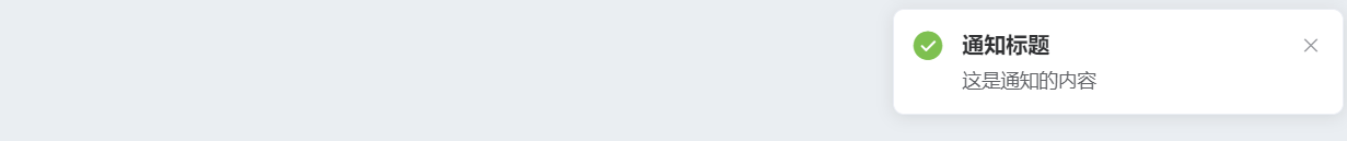
当然,Notification 组件也支持更简洁的调用方式,特别是当你只需要显示不同类型的通知时,可以直接调用预定义的简写方法。这些方法包括 this.$notify.success、this.$notify.warning、this.$notify.info 和 this.$notify.error。
# 2. 简洁用法
在某些场景中,如果你只需要显示带有特定类型的通知,而不需要配置太多其他属性,那么可以使用 Element UI 提供的简写方法。这些方法已经预设了 type 参数,其他配置项如 title、message 和 duration 等,可以继续传入。
- 简洁调用:
this.$notify.success、this.$notify.warning、this.$notify.info和this.$notify.error是简洁调用方法,默认已经包含了type参数,无需额外配置。
<template>
  <el-button type="primary" @click="showSimpleNotification">显示简洁通知</el-button>
</template>

<script>
export default {
  methods: {
    // 方法:显示简洁通知
    showSimpleNotification() {
      // 显示一个主题为 success 的通知
      this.$notify.success({
        title: '操作成功',       // 设置通知的标题
        message: '数据已成功保存', // 设置通知的内容文字
        duration: 3000            // 显示时间,毫秒
      });

      // 显示一个主题为 warning 的通知
      this.$notify.warning({
        title: '操作警告',
        message: '请检查输入内容',
        duration: 3000
      });

      // 显示一个主题为 info 的通知
      this.$notify.info({
        title: '信息提示',
        message: '这里有一些重要的信息',
        duration: 3000
      });

      // 显示一个主题为 error 的通知
      this.$notify.error({
        title: '操作失败',
        message: '保存数据时发生错误',
        duration: 3000
      });
    }
  }
};
</script>
2
3
4
5
6
7
8
9
10
11
12
13
14
15
16
17
18
19
20
21
22
23
24
25
26
27
28
29
30
31
32
33
34
35
36
37
38
39
40
# 3. Notification 属性
| 参数 | 说明 | 类型 | 可选值 | 默认值 |
|---|---|---|---|---|
| title | 通知的标题 | string | — | — |
| message | 通知的说明文字,支持字符串或 Vue VNode | string/Vue.VNode | — | — |
| dangerouslyUseHTMLString | 是否将 message 属性作为 HTML 片段处理 | boolean | — | false |
| type | 通知的主题样式,如果不在可选值内将被忽略 | string | success/warning/info/error | — |
| iconClass | 自定义图标的类名,若设置了 type,则 iconClass 会被覆盖 | string | — | — |
| customClass | 自定义类名 | string | — | — |
| duration | 通知显示时间,以毫秒为单位。设为 0 则不会自动关闭 | number | — | 4500 |
| position | 自定义通知弹出位置 | string | top-right/top-left/bottom-right/bottom-left | top-right |
| showClose | 是否显示关闭按钮 | boolean | — | true |
| onClose | 关闭时的回调函数 | function | — | — |
| onClick | 点击通知时的回调函数 | function | — | — |
| offset | 通知距离窗口顶部的偏移量 | number | — | 0 |
dangerouslyUseHTMLString:当设置为true时,message属性将作为 HTML 片段处理。如果使用此选项,务必确保内容是可信的,以防止 XSS 攻击。
# 4. Notification 方法
当调用 Notification 或 this.$notify 时,会返回当前 Notification 的实例。如果需要手动关闭实例,可以调用它的 close 方法。
方法名
close:关闭当前的通知实例。
<template>
<el-button type="primary" @click="showPersistentNotification">显示持久通知</el-button>
</template>
<script>
export default {
methods: {
showPersistentNotification() {
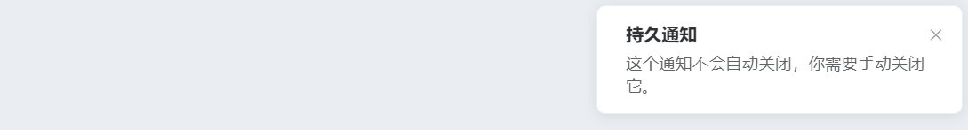
const notificationInstance = this.$notify({
title: '持久通知',
message: '这个通知不会自动关闭,你需要手动关闭它。',
duration: 0, // 持续时间为 0,表示不会自动关闭
showClose: true
});
// 模拟在 10 秒后手动关闭通知
setTimeout(() => {
notificationInstance.close();
}, 10000);
}
}
};
</script>
2
3
4
5
6
7
8
9
10
11
12
13
14
15
16
17
18
19
20
21
22
23
在这个例子中,通知不会自动关闭,用户可以通过点击关闭按钮手动关闭它。10秒后,通知会自动通过调用 close 方法关闭。
# 5. 常用示例
# 基本通知
<template>
<el-button type="primary" @click="showBasicNotification">显示基本通知</el-button>
</template>
<script>
export default {
methods: {
showBasicNotification() {
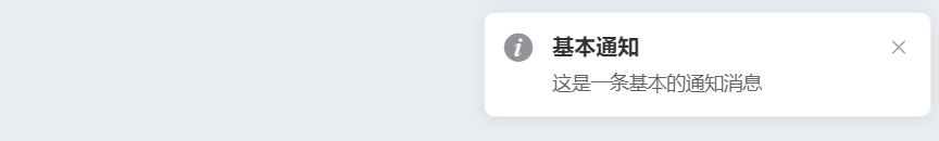
this.$notify({
title: '基本通知',
message: '这是一条基本的通知消息',
type: 'info'
});
}
}
};
</script>
2
3
4
5
6
7
8
9
10
11
12
13
14
15
16
17
- 用法说明:基本的通知消息,可以设置标题、内容和主题样式。
# 带有倾向性
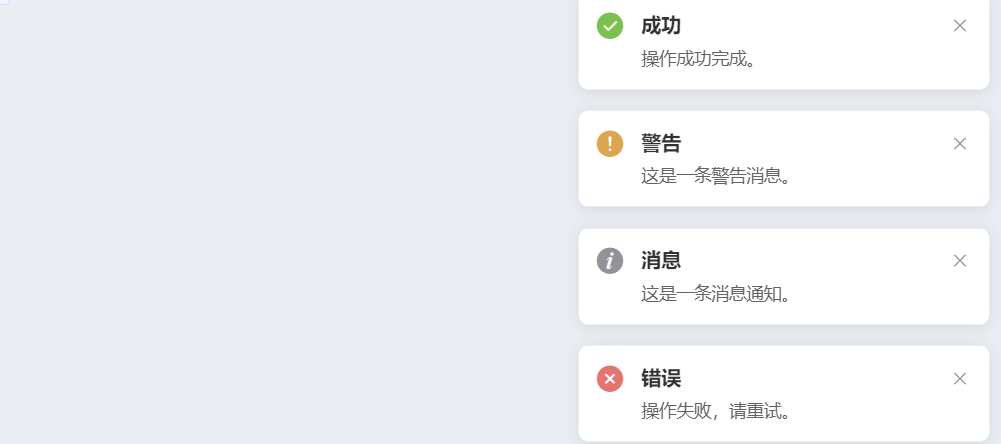
Element UI 的 Notification 组件内置了四种常用的消息类型:
success、warning、info、error。通过type字段可以轻松设置这些消息类型,以便显示系统消息。你还可以使用 Element 为这些类型预注册的方法,直接调用这些方法来显示特定类型的消息。
<template>
  <div>
    <el-button @click="openSuccess">显示成功消息</el-button>
    <el-button @click="openWarning">显示警告消息</el-button>
    <el-button @click="openInfo">显示消息</el-button>
    <el-button @click="openError">显示错误消息</el-button>
  </div>
</template>

<script>
export default {
  methods: {
    openSuccess() {
      this.$notify({
        title: '成功',
        message: '操作成功完成。',
        type: 'success'
      });
    },
    openWarning() {
      this.$notify({
        title: '警告',
        message: '这是一条警告消息。',
        type: 'warning'
      });
    },
    openInfo() {
      this.$notify({
        title: '消息',
        message: '这是一条消息通知。',
        type: 'info'
      });
    },
    openError() {
      this.$notify({
        title: '错误',
        message: '操作失败,请重试。',
        type: 'error'
      });
    }
  }
};
</script>
2
3
4
5
6
7
8
9
10
11
12
13
14
15
16
17
18
19
20
21
22
23
24
25
26
27
28
29
30
31
32
33
34
35
36
37
38
39
40
41
42
43
# 自定义弹出位置
你可以通过 position 属性自定义 Notification 从屏幕四角中的任意一角弹出。支持四个选项:top-right、top-left、bottom-right、bottom-left,默认为 top-right。
<template>
  <div>
    <el-button @click="openTopRight">右上角通知</el-button>
    <el-button @click="openBottomRight">右下角通知</el-button>
    <el-button @click="openBottomLeft">左下角通知</el-button>
    <el-button @click="openTopLeft">左上角通知</el-button>
  </div>
</template>

<script>
export default {
  methods: {
    openTopRight() {
      this.$notify({
        title: '右上角',
        message: '这是一个从右上角弹出的通知。',
        position: 'top-right'
      });
    },
    openBottomRight() {
      this.$notify({
        title: '右下角',
        message: '这是一个从右下角弹出的通知。',
        position: 'bottom-right'
      });
    },
    openBottomLeft() {
      this.$notify({
        title: '左下角',
        message: '这是一个从左下角弹出的通知。',
        position: 'bottom-left'
      });
    },
    openTopLeft() {
      this.$notify({
        title: '左上角',
        message: '这是一个从左上角弹出的通知。',
        position: 'top-left'
      });
    }
  }
};
</script>
2
3
4
5
6
7
8
9
10
11
12
13
14
15
16
17
18
19
20
21
22
23
24
25
26
27
28
29
30
31
32
33
34
35
36
37
38
39
40
41
42
43
# 带有偏移
通过 offset 属性,你可以让 Notification 弹出的消息距屏幕边缘偏移一段距离。所有同时存在的 Notification 实例应该具有相同的偏移量,以保持界面的一致性。
<template>
  <el-button @click="openWithOffset">带偏移的通知</el-button>
</template>

<script>
export default {
  methods: {
    openWithOffset() {
      this.$notify({
        title: '带偏移的通知',
        message: '这个通知距离屏幕边缘有 50px 的偏移。',
        offset: 50 // 设置偏移量
      });
    }
  }
};
</script>
2
3
4
5
6
7
8
9
10
11
12
13
14
15
16
17
# 点击通知触发回调
<template>
  <el-button type="primary" @click="showClickableNotification">点击触发回调</el-button>
</template>

<script>
export default {
  methods: {
    showClickableNotification() {
      this.$notify({
        title: '可点击通知',
        message: '点击这个通知,会触发回调函数',
        onClick: () => {
          this.$message.success('你点击了通知');
        }
      });
    }
  }
};
</script>
2
3
4
5
6
7
8
9
10
11
12
13
14
15
16
17
18
19
- 用法说明:通过
onClick事件处理用户点击通知时的操作。 