 弹框组件 (MessageBox)
# 弹框组件 (MessageBox)
Element UI 的 MessageBox 组件是一套模拟系统消息提示框的模态对话框,用于消息提示、确认消息和提交内容。它可以美化系统自带的 alert、confirm 和 prompt,适合展示较为简单的内容。如果需要弹出较为复杂的内容,建议使用 Dialog 组件。
提示
MessageBox 组件官方文档:https://element.eleme.cn/#/zh-CN/component/message-box (opens new window)
# 1. 全局方法
当你完整引入了 Element UI 后,Vue.prototype 上会自动添加 $msgbox、$alert、$confirm 和 $prompt 这四个全局方法,因此可以直接在 Vue 实例中调用这些方法。
调用方式
$msgbox(options):通用的消息弹框方法,接收配置对象。$alert(message, title, options)或$alert(message, options):用于显示一个消息提示框。$confirm(message, title, options)或$confirm(message, options):用于显示一个确认框。$prompt(message, title, options)或$prompt(message, options):用于显示一个带输入框的提示框。
# 基础用法
在 Vue 中,你可以通过 $msgbox(options) 方法来创建一个通用的消息弹框。
<template>
<!-- 一个按钮,用于触发消息弹框 -->
<el-button type="primary" @click="showMessageBox">显示 MessageBox</el-button>
</template>
<script>
export default {
methods: {
// 方法:显示消息弹框
showMessageBox() {
// 调用 $msgbox 方法,并传入配置对象
this.$msgbox({
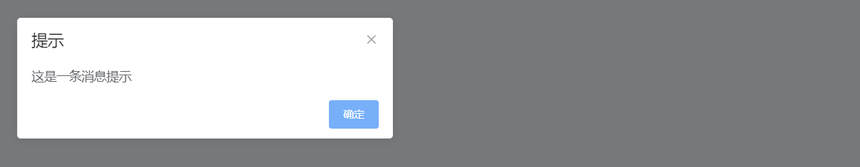
title: '提示', // 弹框的标题
message: '这是一条消息提示', // 弹框中的消息内容,可以是字符串或 VNode
type: 'info', // 消息类型,用于显示对应的图标,可选值:'success', 'info', 'warning', 'error'
showCancelButton: true, // 是否显示取消按钮,默认为 false
confirmButtonText: '确定', // 确定按钮的文本内容,默认值为 '确定'
cancelButtonText: '取消', // 取消按钮的文本内容,默认值为 '取消'
}).then(() => {
this.$message.success('操作已确认');
}).catch(() => {
this.$message.info('操作已取消');
});
}
}
};
</script>
2
3
4
5
6
7
8
9
10
11
12
13
14
15
16
17
18
19
20
21
22
23
24
25
26
27
title:'提示'- 设置消息弹框的标题,显示在弹框顶部。message:'这是一条消息提示'- 设置弹框中的消息内容,可以是简单的字符串或复杂的 VNode。type:'info'- 定义消息类型,会显示相应的图标。可选值有:'success'、'info'、'warning'、'error'。showCancelButton:true- 是否显示取消按钮。如果设置为true,则会显示取消按钮,默认情况下是false。confirmButtonText:'确定'- 设置确定按钮的文本内容,默认值是'确定'。cancelButtonText:'取消'- 设置取消按钮的文本内容,默认值是'取消'。
# 1. 消息提示框 ($alert)
在 MessageBox 的 callback 函数中,通常有两个参数可供使用:
action:表示用户的操作类型,如'confirm'、'cancel'或'close'。instance:表示当前的MessageBox实例,允许你访问和控制MessageBox的属性和方法。
在 $alert 的情况下,回调函数通常只使用第一个参数 action,因为 Alert 只有一个确认按钮,所以 action 一般为 'confirm'。如果你需要对 MessageBox 的实例进行进一步操作或检查,可以使用第二个参数 instance。
<template>
  <el-button type="primary" @click="showAlert">显示 Alert</el-button>
</template>

<script>
export default {
  methods: {
    showAlert() {
      this.$alert('这是一条消息提示', '提示', {
        confirmButtonText: '确定',
        callback: action => {
          this.$message.success('你点击了: ' + action);
        }
      });
    }
  }
};
</script>
2
3
4
5
6
7
8
9
10
11
12
13
14
15
16
17
18
# 2. 确认框 ($confirm)

<template>
  <el-button type="primary" @click="showConfirm">显示 Confirm</el-button>
</template>

<script>
export default {
  methods: {
    showConfirm() {
      this.$confirm('确定要进行此操作吗?', '确认', {
        confirmButtonText: '确定',
        cancelButtonText: '取消',
        type: 'warning'
      }).then(() => {
        this.$message.success('操作已确认');
      }).catch(() => {
        this.$message.info('操作已取消');
      });
    }
  }
};
</script>
2
3
4
5
6
7
8
9
10
11
12
13
14
15
16
17
18
19
20
21
# 3. 带输入框的提示框 ($prompt)
<template>
<el-button type="primary" @click="showPrompt">显示 Prompt</el-button>
</template>
<script>
export default {
methods: {
showPrompt() {
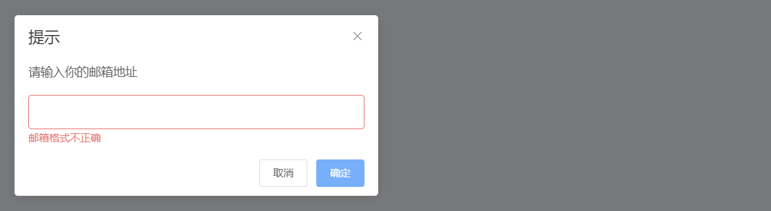
this.$prompt('请输入你的邮箱地址', '提示', {
confirmButtonText: '确定',
cancelButtonText: '取消',
inputPattern: /\S+@\S+\.\S+/,
inputErrorMessage: '邮箱格式不正确'
}).then(({ value }) => {
this.$message.success('你的邮箱是: ' + value);
}).catch(() => {
this.$message.info('输入已取消');
});
}
}
};
</script>
2
3
4
5
6
7
8
9
10
11
12
13
14
15
16
17
18
19
20
21
22
# 2. MessageBox 属性
| 参数 | 说明 | 类型 | 可选值 | 默认值 |
|---|---|---|---|---|
| title | MessageBox 标题 | string | — | — |
| message | MessageBox 消息正文内容 | string / VNode | — | — |
| dangerouslyUseHTMLString | 是否将 message 属性作为 HTML 片段处理 | boolean | — | false |
| type | 消息类型,用于显示图标 | string | success / info / warning / error | — |
| iconClass | 自定义图标的类名,会覆盖 type | string | — | — |
| customClass | MessageBox 的自定义类名 | string | — | — |
| callback | 关闭后的回调函数,参数为 action 和 instance | function | — | — |
| showClose | 是否显示右上角关闭按钮 | boolean | — | true |
| beforeClose | 关闭前的回调,会暂停实例的关闭 | function | — | — |
| distinguishCancelAndClose | 是否将取消(点击取消按钮)与关闭(点击关闭按钮或遮罩层)进行区分 | boolean | — | false |
| lockScroll | 是否在 MessageBox 出现时将 body 滚动锁定 | boolean | — | true |
| showCancelButton | 是否显示取消按钮 | boolean | — | false |
| showConfirmButton | 是否显示确定按钮 | boolean | — | true |
| cancelButtonText | 取消按钮的文本内容 | string | — | 取消 |
| confirmButtonText | 确定按钮的文本内容 | string | — | 确定 |
| cancelButtonClass | 取消按钮的自定义类名 | string | — | — |
| confirmButtonClass | 确定按钮的自定义类名 | string | — | — |
| closeOnClickModal | 是否可通过点击遮罩关闭 MessageBox | boolean | — | true (alert 为 false) |
| closeOnPressEscape | 是否可通过按下 ESC 键关闭 MessageBox | boolean | — | true (alert 为 false) |
| closeOnHashChange | 是否在 hashchange 时关闭 MessageBox | boolean | — | true |
| showInput | 是否显示输入框 | boolean | — | false (prompt 为 true) |
| inputPlaceholder | 输入框的占位符 | string | — | — |
| inputType | 输入框的类型 | string | — | text |
| inputValue | 输入框的初始文本 | string | — | — |
| inputPattern | 输入框的校验表达式 | regexp | — | — |
| inputValidator | 输入框的校验函数。返回布尔值或字符串,字符串为错误提示 | function | — | — |
| inputErrorMessage | 校验未通过时的提示文本 | string | — | 输入的数据不合法! |
| center | 是否居中布局 | boolean | — | false |
| roundButton | 是否使用圆角按钮 | boolean | — | false |
# 3. 弹框组件常见示例
# 确认框结合异步操作
1. 使用 try-catch 进行处理(直接处理异步操作):这种方法逻辑简单直接,适合处理简单的确认操作。
<template>
  <el-button type="primary" @click="showConfirm">显示 Confirm</el-button>
</template>

<script>
export default {
  methods: {
    async showConfirm() {
      try {
        // 先进行确认操作
        await this.$confirm('确定要进行此操作吗?', '确认', {
          confirmButtonText: '确定',
          cancelButtonText: '取消',
          type: 'warning'
        });

        // 如果确认,执行后续操作
        this.$message.success('操作已确认');
        // 在这里进行其他异步操作或逻辑处理
      } catch (error) {
        // 判断是用户取消操作,还是请求失败
        if (error === 'cancel') {
          this.$message.info('已取消删除');
        } else {
          this.$message.error('删除失败');
        }
      }
    }
  }
};
</script>
2
3
4
5
6
7
8
9
10
11
12
13
14
15
16
17
18
19
20
21
22
23
24
25
26
27
28
29
30
31
2. 使用 beforeClose 钩子进行处理:这种方法提供了更灵活的控制,允许在点击确认按钮后但在关闭对话框之前执行操作。
<template>
  <el-button type="primary" @click="showConfirm">显示 Confirm</el-button>
</template>

<script>
export default {
  methods: {
    showConfirm() {
      this.$confirm('确定要进行此操作吗?', '确认', {
        confirmButtonText: '确定',
        cancelButtonText: '取消',
        type: 'warning',
        beforeClose: (action, instance, done) => {
          if (action === 'confirm') {
            // 先进行一些操作,例如异步请求
            this.someAsyncOperation().then(() => {
              // 操作成功后关闭弹框
              done();
              this.$message.success('操作已确认');
            }).catch(() => {
              // 操作失败时显示错误消息,但不关闭弹框
              this.$message.error('操作失败,请重试');
            });
          } else {
            // 如果用户点击了取消按钮,直接关闭弹框
            done();
            this.$message.info('操作已取消');
          }
        }
      }).catch(() => {
        // 如果用户关闭了对话框
        this.$message.info('操作已取消');
      });
    },
    // 模拟异步操作的函数
    someAsyncOperation() {
      return new Promise((resolve, reject) => {
        setTimeout(() => {
          const success = Math.random() > 0.5;
          success ? resolve() : reject();
        }, 1000);
      });
    }
  }
};
</script>
2
3
4
5
6
7
8
9
10
11
12
13
14
15
16
17
18
19
20
21
22
23
24
25
26
27
28
29
30
31
32
33
34
35
36
37
38
39
40
41
42
43
44
45
46
::: tip对比与选择
第一种方法(
try-catch):代码更为简洁,适合大多数确认操作的场景。推荐在操作逻辑比较简单的情况下使用,比如只是做一些删除确认或简单的异步请求。第二种方法(
beforeClose):提供了更多的控制力,可以在点击确认后决定是否要关闭对话框,非常适合需要在操作前后进行多步逻辑或在某些条件下阻止对话框关闭的情况。
:::
# 居中布局与圆角按钮
通过 center 和 roundButton 属性,可以实现消息框内容居中显示,以及使用圆角按钮。

<template>
  <el-button type="primary" @click="showCenteredAlert">居中布局与圆角按钮</el-button>
</template>

<script>
export default {
  methods: {
    showCenteredAlert() {
      this.$alert('这是一个居中显示的消息框', '提示', {
        center: true,
        roundButton: true,
        confirmButtonText: '知道了'
      });
    }
  }
};
</script>
2
3
4
5
6
7
8
9
10
11
12
13
14
15
16
17
# 自定义图标与按钮类名
你可以通过 iconClass 自定义消息框的图标,通过 confirmButtonClass 和 cancelButtonClass 自定义按钮的样式。

<template>
  <el-button type="primary" @click="showCustomMessageBox">自定义图标与按钮</el-button>
</template>

<script>
export default {
  methods: {
    showCustomMessageBox() {
      this.$confirm('确认删除这条记录吗?', '警告', {
        iconClass: 'el-icon-warning',
        confirmButtonText: '删除',
        cancelButtonText: '取消',
        confirmButtonClass: 'custom-confirm-button',
        cancelButtonClass: 'custom-cancel-button',
        type: 'warning'
      }).then(() => {
        this.$message.success('记录已删除');
      }).catch(() => {
        this.$message.info('操作已取消');
      });
    }
  }
};
</script>

<style>
.custom-confirm-button {
  background-color: #f56c6c;
  border-color: #f56c6c;
}

.custom-cancel-button {
  background-color: #909399;
  border-color: #909399;
}
</style>
2
3
4
5
6
7
8
9
10
11
12
13
14
15
16
17
18
19
20
21
22
23
24
25
26
27
28
29
30
31
32
33
34
35
36
# 4. 弹框组件常用场景
# 简单消息提示
- 适用场景:用户操作后需要立即显示结果,如保存成功、操作失败等。
- 实现方式:使用
$alert方法。
# 操作确认
- 适用场景:涉及重要操作或不可逆操作,如删除记录、提交表单等。
- 实现方式:使用
$confirm方法,并结合then和catch方法处理用户选择。
# 输入框提示
- 适用场景:需要用户输入特定信息,如输入密码、邮箱地址、数量等。
- 实现方式:使用
$prompt方法,并结合输入框的校验功能。