 上传(Upload)
# 上传(Upload)
Element-UI 的上传组件用于通过点击或拖拽上传文件。它支持多文件上传、自定义上传行为等功能,并提供丰富的事件钩子以实现复杂的业务需求。
提示
上传(Upload)组件官方文档:https://element.eleme.cn/#/zh-CN/component/upload (opens new window)
# 1. 基本用法
基本语法:在 Vue 组件中使用 <el-upload> 标签创建一个上传组件,通过 action 属性指定上传的地址,并使用 v-model 绑定上传的文件列表。
<template>
  <el-upload
    action="https://jsonplaceholder.typicode.com/posts/"
    :file-list="fileList"
    :on-success="handleSuccess"
    :on-error="handleError"
  >
    <el-button slot="trigger" type="primary">点击上传</el-button>
    <div slot="tip" class="el-upload__tip">只能上传jpg/png文件,且不超过500kb</div>
  </el-upload>
</template>

<script>
export default {
  data() {
    return {
      fileList: []
    };
  },
  methods: {
    handleSuccess(response, file, fileList) {
      console.log('上传成功:', response);
    },
    handleError(err, file, fileList) {
      console.error('上传失败:', err);
    }
  }
};
</script>
2
3
4
5
6
7
8
9
10
11
12
13
14
15
16
17
18
19
20
21
22
23
24
25
26
27
28
29
action属性:必选参数,用于指定上传文件的地址。- 事件钩子:如
on-success和on-error,用于处理上传成功和失败的回调函数。 
# Upload 属性
| 参数 | 说明 | 类型 | 可选值 | 默认值 |
|---|---|---|---|---|
| action | 必选参数,上传的地址 | string | — | — |
| headers | 设置上传的请求头部 | object | — | — |
| multiple | 是否支持多选文件 | boolean | — | false |
| data | 上传时附带的额外参数 | object | — | — |
| name | 上传的文件字段名 | string | — | file |
| with-credentials | 支持发送 cookie 凭证信息 | boolean | — | false |
| show-file-list | 是否显示已上传文件列表 | boolean | — | true |
| drag | 是否启用拖拽上传 | boolean | — | false |
| accept | 接受上传的文件类型(thumbnail-mode 模式下此参数无效) | string | — | — |
| on-preview | 点击文件列表中已上传的文件时的钩子 | function(file) | — | — |
| on-remove | 文件列表移除文件时的钩子 | function(file, fileList) | — | — |
| on-success | 文件上传成功时的钩子 | function(response, file, fileList) | — | |
| on-error | 文件上传失败时的钩子 | function(err, file, fileList) | — | |
| on-progress | 文件上传时的钩子 | function(event, file, fileList) | — | |
| on-change | 文件状态改变时的钩子,添加文件、上传成功和上传失败时都会被调用 | function(file, fileList) | — | |
| before-upload | 上传文件之前的钩子,参数为上传的文件,若返回 false 或者返回 Promise 且被 reject,则停止上传 | function(file) | — | — |
| before-remove | 删除文件之前的钩子,参数为上传的文件和文件列表,若返回 false 或者返回 Promise 且被 reject,则停止删除 | function(file, fileList) | — | |
| list-type | 文件列表的类型 | string | text/picture/picture-card | text |
| auto-upload | 是否在选取文件后立即进行上传 | boolean | — | true |
| file-list | 上传的文件列表, 例如: [{name: 'food.jpg', url: 'https://xxx.cdn.com/xxx.jpg'}] | array | — | [] |
| http-request | 覆盖默认的上传行为,可以自定义上传的实现 | function | — | — |
| disabled | 是否禁用 | boolean | — | false |
| limit | 最大允许上传个数 | number | — | — |
| on-exceed | 文件超出个数限制时的钩子 | function(files, fileList) | — | — |
# Upload 插槽
| 名称 | 说明 |
|---|---|
| trigger | 触发文件选择框的内容 |
| tip | 提示说明文字 |
# Upload 方法
| 方法名 | 说明 | 参数 |
|---|---|---|
| clearFiles | 清空已上传的文件列表(该方法不支持在 before-upload 中调用) | — |
| abort | 取消上传请求 | file: fileList 中的 file 对象 |
| submit | 手动上传文件列表 | — |
# 2. 常见上传示例
# 基础文件上传
通过 action 属性指定上传地址,并使用 v-model 绑定上传文件列表。
<template>
  <el-upload
    action="https://jsonplaceholder.typicode.com/posts/"
    :file-list="fileList"
  >
    <el-button slot="trigger" type="primary">点击上传</el-button>
    <div slot="tip" class="el-upload__tip">只能上传jpg/png文件,且不超过500kb</div>
  </el-upload>
</template>

<script>
export default {
  data() {
    return {
      fileList: []
    };
  }
};
</script>
2
3
4
5
6
7
8
9
10
11
12
13
14
15
16
17
18
19
- 基本用法:用户点击按钮选择文件进行上传,上传的文件列表显示在组件内。

# 多文件上传
通过 multiple 属性支持多文件上传。
<template>
  <el-upload
    action="https://jsonplaceholder.typicode.com/posts/"
    :file-list="fileList"
    multiple
  >
    <el-button slot="trigger" type="primary">点击上传多个文件</el-button>
    <div slot="tip" class="el-upload__tip">只能上传jpg/png文件,且不超过500kb</div>
  </el-upload>
</template>

<script>
export default {
  data() {
    return {
      fileList: []
    };
  }
};
</script>
2
3
4
5
6
7
8
9
10
11
12
13
14
15
16
17
18
19
20
- 多文件上传:通过
multiple属性支持一次选择多个文件上传。 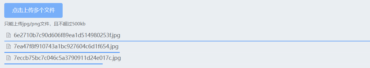
# 拖拽上传
通过 drag 属性支持拖拽上传。
<template>
  <el-upload
    action="https://jsonplaceholder.typicode.com/posts/"
    :file-list="fileList"
    drag
  >
    <i class="el-icon-upload"></i>
    <div class="el-upload__text">将文件拖到此处,或<em>点击上传</em></div>
    <div slot="tip" class="el-upload__tip">只能上传jpg/png文件,且不超过500kb</div>
  </el-upload>
</template>

<script>
export default {
  data() {
    return {
      fileList: []
    };
  }
};
</script>
2
3
4
5
6
7
8
9
10
11
12
13
14
15
16
17
18
19
20
21
- 拖拽上传:通过
drag属性支持用户将文件拖拽到上传区域进行上传。 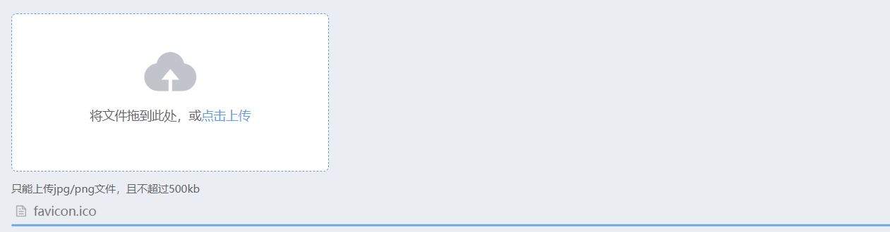
# 显示上传进度
通过 on-progress 事件处理上传进度。
<template>
  <el-upload
    action="https://jsonplaceholder.typicode.com/posts/"
    :file-list="fileList"
    :on-progress="handleProgress"
  >
    <el-button slot="trigger" type="primary">点击上传</el-button>
    <div slot="tip" class="el-upload__tip">只能上传jpg/png文件,且不超过500kb</div>
  </el-upload>
</template>

<script>
export default {
  data() {
    return {
      fileList: []
    };
  },
  methods: {
    handleProgress(event, file, fileList) {
      console.log('上传进度:', event.percent, '%');
    }
  }
};
</script>
2
3
4
5
6
7
8
9
10
11
12
13
14
15
16
17
18
19
20
21
22
23
24
25
- 上传进度:通过
on-progress事件处理,实时显示上传进度。 
# 自定义上传实现
通过 http-request 方法自定义上传行为。
<template>
  <el-upload
    :http-request="customRequest"
  >
    <el-button slot="trigger" type="primary">点击上传</el-button>
    <div slot="tip" class="el-upload__tip">只能上传jpg/png文件,且不超过500kb</div>
  </el-upload>
</template>

<script>
export default {
  methods: {
    customRequest({file, onSuccess}) {
      setTimeout(() => {
        console.log('自定义上传实现:', file);
        onSuccess('上传成功');
      }, 1000);
    }
  }
};
</script>
2
3
4
5
6
7
8
9
10
11
12
13
14
15
16
17
18
19
20
21
- 自定义上传:通过
http-request方法覆盖默认的上传行为,实现自定义上传逻辑。 
# 3. 其他示例
# 限制上传文件个数
通过 limit 和 on-exceed 属性限制上传文件的个数,并定义超出限制时的行为。
<template>
  <el-upload
    action="https://jsonplaceholder.typicode.com/posts/"
    :file-list="fileList"
    :limit="3"
    :on-exceed="handleExceed"
  >
    <el-button slot="trigger" type="primary">点击上传(最多3个文件)</el-button>
    <div slot="tip" class="el-upload__tip">只能上传jpg/png文件,且不超过500kb</div>
  </el-upload>
</template>

<script>
export default {
  data() {
    return {
      fileList: []
    };
  },
  methods: {
    handleExceed(files, fileList) {
      console.log('文件超出限制:', files, fileList);
    }
  }
};
</script>
2
3
4
5
6
7
8
9
10
11
12
13
14
15
16
17
18
19
20
21
22
23
24
25
26
- 文件限制:通过
limit属性限制最多上传文件个数,并通过on-exceed事件处理超出限制的情况。 
# 用户头像上传
使用 before-upload 限制用户上传的图片格式和大小。
<template>
  <el-upload
    class="avatar-uploader"
    action="https://jsonplaceholder.typicode.com/posts/"
    :show-file-list="false"
    :on-success="handleAvatarSuccess"
    :before-upload="beforeAvatarUpload"
  >
    <img v-if="imageUrl" :src="imageUrl" class="avatar" />
    <i v-else class="el-icon-plus avatar-uploader-icon"></i>
  </el-upload>
</template>

<script>
export default {
  data() {
    return {
      imageUrl: ''
    };
  },
  methods: {
    handleAvatarSuccess(res, file) {
      this.imageUrl = URL.createObjectURL(file.raw);
    },
    beforeAvatarUpload(file) {
      const isJPG = file.type === 'image/jpeg';
      const isLt2M = file.size / 1024 / 1024 < 2;

      if (!isJPG) {
        this.$message.error('上传头像图片只能是 JPG 格式!');
      }
      if (!isLt2M) {
        this.$message.error('上传头像图片大小不能超过 2MB!');
      }
      return isJPG && isLt2M;
    }
  }
};
</script>

<style scoped>
.avatar-uploader .el-upload {
  border: 1px dashed #d9d9d9;
  border-radius: 6px;
  cursor: pointer;
  position: relative;
  overflow: hidden;
  width: 178px;
  height: 178px;
}
.avatar-uploader .el-upload:hover {
  border-color: #409EFF;
}
.avatar-uploader-icon {
  font-size: 28px;
  color: #8c939d;
  width: 178px;
  height: 178px;
  line-height: 178px;
  text-align: center;
}
.avatar {
  width: 178px;
  height: 178px;
  display: block;
}
</style>
2
3
4
5
6
7
8
9
10
11
12
13
14
15
16
17
18
19
20
21
22
23
24
25
26
27
28
29
30
31
32
33
34
35
36
37
38
39
40
41
42
43
44
45
46
47
48
49
50
51
52
53
54
55
56
57
58
59
60
61
62
63
64
65
66
67
- 头像上传:通过
before-upload事件限制上传的图片格式和大小。 
# 照片墙
使用 list-type 属性设置文件列表的样式。
<template>
  <el-upload
    action="https://jsonplaceholder.typicode.com/posts/"
    list-type="picture-card"
    :on-preview="handlePictureCardPreview"
    :on-remove="handleRemove"
  >
    <i class="el-icon-plus"></i>
    <div slot="tip" class="el-upload__tip">只能上传jpg/png文件,且不超过500kb</div>
  </el-upload>
  <el-dialog :visible.sync="dialogVisible">
    <img width="100%" :src="dialogImageUrl" alt="">
  </el-dialog>
</template>

<script>
export default {
  data() {
    return {
      dialogImageUrl: '',
      dialogVisible: false
    };
  },
  methods: {
    handleRemove(file, fileList) {
      console.log(file, fileList);
    },
    handlePictureCardPreview(file) {
      this.dialogImageUrl = file.url;
      this.dialogVisible = true;
    }
  }
};
</script>
2
3
4
5
6
7
8
9
10
11
12
13
14
15
16
17
18
19
20
21
22
23
24
25
26
27
28
29
30
31
32
33
34
- 照片墙:通过
list-type="picture-card"属性设置文件列表为图片卡片样式。 
# 文件缩略图
使用 scoped-slot 设置缩略图模版。
<template>
  <el-upload
    action="https://jsonplaceholder.typicode.com/posts/"
    list-type="picture-card"
    :auto-upload="false"
  >
    <i slot="default" class="el-icon-plus"></i>
    <div slot="file" slot-scope="{file}">
      <img class="el-upload-list__item-thumbnail" :src="file.url" alt="" style="width: 100px; height: 100px;">
      <span class="el-upload-list__item-actions">
        <span class="el-upload-list__item-preview" @click="handlePictureCardPreview(file)">
          <i class="el-icon-zoom-in"></i>
        </span>
        <span v-if="!disabled" class="el-upload-list__item-delete" @click="handleDownload(file)">
          <i class="el-icon-download"></i>
        </span>
        <span v-if="!disabled" class="el-upload-list__item-delete" @click="handleRemove(file)">
          <i class="el-icon-delete"></i>
        </span>
      </span>
    </div>
  </el-upload>
  <el-dialog :visible.sync="dialogVisible">
    <img width="100%" :src="dialogImageUrl" alt="">
  </el-dialog>
</template>

<script>
export default {
  data() {
    return {
      dialogImageUrl: '',
      dialogVisible: false,
      disabled: false
    };
  },
  methods: {
    handleRemove(file) {
      console.log(file);
    },
    handlePictureCardPreview(file) {
      this.dialogImageUrl = file.url;
      this.dialogVisible = true;
    },
    handleDownload(file) {
      console.log(file);
    }
  }
};
</script>
2
3
4
5
6
7
8
9
10
11
12
13
14
15
16
17
18
19
20
21
22
23
24
25
26
27
28
29
30
31
32
33
34
35
36
37
38
39
40
41
42
43
44
45
46
47
48
49
50
- 文件缩略图:通过
scoped-slot自定义文件列表的缩略图显示样式。 
# 上传文件列表控制
通过 on-change 钩子函数对列表进行控制。
<template>
  <el-upload
    action="https://jsonplaceholder.typicode.com/posts/"
    :file-list="fileList"
    :on-change="handleChange"
  >
    <el-button slot="trigger" type="primary">点击上传</el-button>
    <div slot="tip" class="el-upload__tip">只能上传jpg/png文件,且不超过500kb</div>
  </el-upload>
</template>

<script>
export default {
  data() {
    return {
      fileList: []
    };
  },
  methods: {
    handleChange(file, fileList) {
      console.log('文件状态变化:', file, fileList);
      this.fileList = fileList; // 更新文件列表
    }
  }
};
</script>
2
3
4
5
6
7
8
9
10
11
12
13
14
15
16
17
18
19
20
21
22
23
24
25
26
- 文件列表控制:通过
on-change事件处理,动态更新文件列表。 
总结
- 多种上传方式:支持点击上传、拖拽上传、多文件上传等多种方式。
- 灵活的属性配置:通过
action、multiple、drag、accept等属性可以自定义上传行为。 - 丰富的事件处理:支持
on-success、on-error、on-progress、on-change等事件,允许开发者处理上传过程中的各个阶段。 - 自定义上传实现:通过
http-request方法可以实现自定义上传逻辑,满足特殊需求。 - 多样化的上传示例:如头像上传、照片墙、文件缩略图等,可以满足各种实际应用场景的需求。
# 4. 自定义头像上传
# 1. 自定义头像上传实现
Element-UI 上传组件默认情况下不提供头像上传成功后覆盖上传组件的位置的功能,可以通过自定义样式和插槽实现这一功能。
<template>
<div id="app">
<el-upload
class="avatar-uploader"
action="https://jsonplaceholder.typicode.com/posts/"
:show-file-list="false"
:on-success="handleAvatarSuccess"
:on-error="handleAvatarError"
:before-upload="beforeAvatarUpload"
:on-progress="handleProgress"
drag
>
<div v-if="uploading" class="progress-wrapper">
<el-progress type="circle" :percentage="uploadPercentage"></el-progress>
<div class="progress-text">{{ uploadPercentage }}%</div>
</div>
<div v-else-if="imageUrl" class="avatar-container">
<img :src="imageUrl" class="avatar" />
</div>
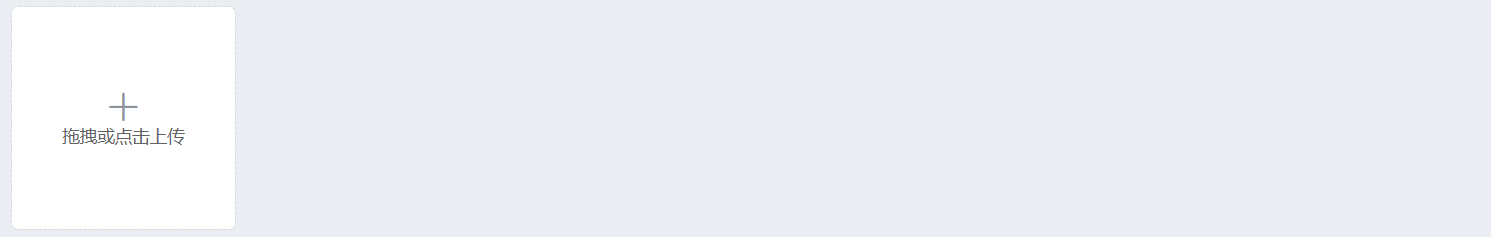
<div v-else class="upload-placeholder">
<i class="el-icon-plus avatar-uploader-icon"></i>
<div class="el-upload__text">拖拽或点击上传</div>
</div>
</el-upload>
</div>
</template>
<script>
export default {
data() {
return {
imageUrl: '', // 用于存储上传成功后的图片URL
uploading: false, // 上传状态
uploadPercentage: 0 // 上传进度百分比
};
},
methods: {
// 上传成功后的处理函数
handleAvatarSuccess(response, file) {
this.uploading = false; // 结束上传状态
this.imageUrl = response.url; // 使用服务器返回的URL
},
// 上传失败后的处理函数
handleAvatarError(err, file) {
this.uploading = false; // 结束上传状态
this.$message.error('上传失败,请重试!');
},
// 上传前的检查函数,限制文件格式和大小
beforeAvatarUpload(file) {
const isJPG = file.type === 'image/jpeg' || file.type === 'image/png';
const isLt500K = file.size / 1024 / 1024 < 0.5;
if (!isJPG) {
this.$message.error('上传头像图片只能是 JPG 或 PNG 格式!');
}
if (!isLt500K) {
this.$message.error('上传头像图片大小不能超过 500KB!');
}
this.uploading = true; // 开始上传状态
this.uploadPercentage = 0; // 重置进度条
return isJPG && isLt500K;
},
// 处理上传进度
handleProgress(event, file, fileList) {
this.uploadPercentage = Math.round((event.loaded / event.total) * 100);
}
}
};
</script>
<style scoped>
/* 上传组件的主要容器样式 */
.avatar-uploader {
position: relative; /* 定位方式为相对定位,以便内部元素定位 */
width: 178px; /* 固定宽度 */
height: 178px; /* 固定高度 */
border: 1px dashed #d9d9d9; /* 边框样式为虚线 */
border-radius: 6px; /* 边框圆角 */
cursor: pointer; /* 鼠标指针样式为手形 */
overflow: hidden; /* 隐藏溢出内容 */
display: flex; /* 使用弹性布局 */
align-items: center; /* 垂直居中对齐 */
justify-content: center; /* 水平居中对齐 */
}
/* 包含上传图片的容器样式 */
.avatar-container {
width: 100%; /* 宽度为父元素的100% */
height: 100%; /* 高度为父元素的100% */
display: flex; /* 使用弹性布局 */
align-items: center; /* 垂直居中对齐 */
justify-content: center; /* 水平居中对齐 */
border-radius: 6px; /* 边框圆角 */
overflow: hidden; /* 隐藏溢出内容 */
}
/* 上传图标样式 */
.avatar-uploader-icon {
font-size: 28px; /* 字体大小 */
color: #8c939d; /* 字体颜色 */
}
/* 上传的图片样式 */
.avatar {
max-width: 100%; /* 最大宽度为父元素的100% */
max-height: 100%; /* 最大高度为父元素的100% */
object-fit: contain; /* 保持图像的长宽比 */
}
/* 上传占位符样式 */
.upload-placeholder {
display: flex; /* 使用弹性布局 */
flex-direction: column; /* 垂直排列 */
align-items: center; /* 垂直居中对齐 */
justify-content: center; /* 水平居中对齐 */
width: 100%; /* 宽度为父元素的100% */
height: 100%; /* 高度为父元素的100% */
}
/* 进度条容器样式 */
.progress-wrapper {
position: absolute; /* 定位方式为绝对定位 */
top: 50%; /* 垂直居中 */
left: 50%; /* 水平居中 */
transform: translate(-50%, -50%); /* 移动到中心位置 */
width: 80px; /* 固定宽度 */
height: 80px; /* 固定高度 */
display: flex; /* 使用弹性布局 */
flex-direction: column; /* 垂直排列 */
align-items: center; /* 垂直居中对齐 */
justify-content: center; /* 水平居中对齐 */
}
/* 进度条文本样式 */
.progress-text {
margin-top: 8px; /* 顶部外边距 */
font-size: 14px; /* 字体大小 */
color: #606266; /* 字体颜色 */
}
</style>
2
3
4
5
6
7
8
9
10
11
12
13
14
15
16
17
18
19
20
21
22
23
24
25
26
27
28
29
30
31
32
33
34
35
36
37
38
39
40
41
42
43
44
45
46
47
48
49
50
51
52
53
54
55
56
57
58
59
60
61
62
63
64
65
66
67
68
69
70
71
72
73
74
75
76
77
78
79
80
81
82
83
84
85
86
87
88
89
90
91
92
93
94
95
96
97
98
99
100
101
102
103
104
105
106
107
108
109
110
111
112
113
114
115
116
117
118
119
120
121
122
123
124
125
126
127
128
129
130
131
132
133
134
135
136
137
138
139
140
- 拖拽上传:通过
drag属性启用拖拽上传功能。 - 隐藏文件列表:通过
:show-file-list="false"属性隐藏默认的文件列表。 - 上传成功处理:通过
:on-success="handleAvatarSuccess"处理上传成功后的回调,将返回的图片 URL 存储在imageUrl变量中。 - 上传失败处理:通过
:on-error="handleAvatarError"处理上传失败后的回调,显示错误信息。 - 上传前检查:通过
:before-upload="beforeAvatarUpload"处理上传前的检查,确保上传的文件格式和大小符合要求。 - 进度条居中:使用绝对定位和
transform属性确保进度条始终在上传容器的中心。 - 上传状态处理:上传成功或失败后,
uploading状态设置为false,隐藏进度条。 - 进度条文本:添加了
progress-text类,用于显示上传进度的百分比。 - 自定义样式:通过 CSS 样式实现上传组件的位置覆盖功能,当
imageUrl有值时显示上传的图片,否则显示上传图标和提示文字。avatar-uploader:定义上传组件的主要容器样式,包括大小、边框、定位等。avatar-container:包含上传图片的容器,设置为100%宽高以覆盖整个上传区域。avatar-uploader-icon:上传图标的样式,包括字体大小和颜色。avatar:上传的图片样式,设置为100%宽高以覆盖整个上传区域。upload-placeholder:上传占位符样式,在上传组件为空时显示上传图标和提示文字,覆盖整个上传区域。object-fit: contain:保持图像的长宽比,并确保图像完整地显示在容器内。max-width和max-height:将上传的图片样式设置为max-width: 100%和max-height: 100%,确保图片在容器内不被放大失真。
# 2. 封装 AvatarUploader 组件
AvatarUploader.vue
子组件(AvatarUploader.vue)通过 props 接收 父组件绑定的value值和action值,并在头像上传成功后通过 $emit 触发 父组件绑定在子组件上的input 事件,将新图片 URL 传递给父组件。
- 父组件给子组件绑定
v-model="avatarUrl"其实就等价于:value="avatarUrl" @input="avatarUrl= $event.target.value"。 - 子组件可以使用
props去接收,并且子组件去通过$emit触发 父组件绑定在子组件上的input事件的时候,父组件是不需要手动去编写input事件去完成数据的更新的,一切都是vue自动完成的。
<template>
  <div>
    <el-upload
      class="avatar-uploader"
      :action="action"
      :headers="headers"
      :show-file-list="false"
      :on-success="handleAvatarSuccess"
      :on-error="handleAvatarError"
      :before-upload="beforeAvatarUpload"
      :on-progress="handleProgress"
      drag
    >
      <div v-if="uploading" class="progress-wrapper">
        <el-progress type="circle" :percentage="uploadPercentage"></el-progress>
        <div class="progress-text">{{ uploadPercentage }}%</div>
      </div>
      <div v-else-if="imageUrl" class="avatar-container">
        <img :src="imageUrl" class="avatar" />
      </div>
      <div v-else class="upload-placeholder">
        <i class="el-icon-plus avatar-uploader-icon"></i>
        <div class="el-upload__text">拖拽或点击上传</div>
      </div>
    </el-upload>
  </div>
</template>

<script>
export default {
  name: 'AvatarUploader',
  props: {
    action: {
      type: String,
      required: true
    },
    headers: {
      type: Object,
      default: () => ({})
    },
    value: {
      type: String,
      default: ''
    }
  },
  data() {
    return {
      imageUrl: this.value, // 用于存储上传成功后的图片URL
      uploading: false, // 上传状态
      uploadPercentage: 0 // 上传进度百分比
    };
  },
  watch: {
    value(newVal) {
      this.imageUrl = newVal;
    }
  },
  methods: {
    // 上传成功后的处理函数
    handleAvatarSuccess(response, file) {
      this.uploading = false; // 结束上传状态
      this.imageUrl = response.url; // 使用服务器返回的URL
      this.$emit('input', this.imageUrl);
    },
    // 上传失败后的处理函数
    handleAvatarError(err, file) {
      this.uploading = false; // 结束上传状态
      this.$message.error('上传失败,请重试!');
    },
    // 上传前的检查函数,限制文件格式和大小
    beforeAvatarUpload(file) {
      const isJPG = file.type === 'image/jpeg' || file.type === 'image/png';
      const isLt500K = file.size / 1024 / 1024 < 0.5;

      if (!isJPG) {
        this.$message.error('上传头像图片只能是 JPG 或 PNG 格式!');
        return false;  // 验证失败时返回 false,避免进度条显示。
      }
      if (!isLt500K) {
        this.$message.error('上传头像图片大小不能超过 500KB!');
        return false;
      }
      this.uploading = true; // 开始上传状态
      this.uploadPercentage = 0; // 重置进度条
      return isJPG && isLt500K;
    },
    // 处理上传进度
    handleProgress(event, file, fileList) {
      this.uploadPercentage = Math.round((event.loaded / event.total) * 100);
    }
  }
};
</script>

<style scoped>
/* 上传组件的主要容器样式 */
.avatar-uploader {
  position: relative; /* 定位方式为相对定位,以便内部元素定位 */
  width: 178px; /* 固定宽度 */
  height: 178px; /* 固定高度 */
  border: 1px dashed #d9d9d9; /* 边框样式为虚线 */
  border-radius: 6px; /* 边框圆角 */
  cursor: pointer; /* 鼠标指针样式为手形 */
  overflow: hidden; /* 隐藏溢出内容 */
  display: flex; /* 使用弹性布局 */
  align-items: center; /* 垂直居中对齐 */
  justify-content: center; /* 水平居中对齐 */
}

/* 包含上传图片的容器样式 */
.avatar-container {
  width: 100%; /* 宽度为父元素的100% */
  height: 100%; /* 高度为父元素的100% */
  display: flex; /* 使用弹性布局 */
  align-items: center; /* 垂直居中对齐 */
  justify-content: center; /* 水平居中对齐 */
  border-radius: 6px; /* 边框圆角 */
  overflow: hidden; /* 隐藏溢出内容 */
}

/* 上传图标样式 */
.avatar-uploader-icon {
  font-size: 28px; /* 字体大小 */
  color: #8c939d; /* 字体颜色 */
}

/* 上传的图片样式 */
.avatar {
  max-width: 100%; /* 最大宽度为父元素的100% */
  max-height: 100%; /* 最大高度为父元素的100% */
  object-fit: contain; /* 保持图像的长宽比 */
}

/* 上传占位符样式 */
.upload-placeholder {
  display: flex; /* 使用弹性布局 */
  flex-direction: column; /* 垂直排列 */
  align-items: center; /* 垂直居中对齐 */
  justify-content: center; /* 水平居中对齐 */
  width: 100%; /* 宽度为父元素的100% */
  height: 100%; /* 高度为父元素的100% */
}

/* 进度条容器样式 */
.progress-wrapper {
  position: absolute; /* 定位方式为绝对定位 */
  top: 50%; /* 垂直居中 */
  left: 50%; /* 水平居中 */
  transform: translate(-50%, -50%); /* 移动到中心位置 */
  width: 80px; /* 固定宽度 */
  height: 80px; /* 固定高度 */
  display: flex; /* 使用弹性布局 */
  flex-direction: column; /* 垂直排列 */
  align-items: center; /* 垂直居中对齐 */
  justify-content: center; /* 水平居中对齐 */
}

/* 进度条文本样式 */
.progress-text {
  margin-top: 8px; /* 顶部外边距 */
  font-size: 14px; /* 字体大小 */
  color: #606266; /* 字体颜色 */
}
</style>
2
3
4
5
6
7
8
9
10
11
12
13
14
15
16
17
18
19
20
21
22
23
24
25
26
27
28
29
30
31
32
33
34
35
36
37
38
39
40
41
42
43
44
45
46
47
48
49
50
51
52
53
54
55
56
57
58
59
60
61
62
63
64
65
66
67
68
69
70
71
72
73
74
75
76
77
78
79
80
81
82
83
84
85
86
87
88
89
90
91
92
93
94
95
96
97
98
99
100
101
102
103
104
105
106
107
108
109
110
111
112
113
114
115
116
117
118
119
120
121
122
123
124
125
126
127
128
129
130
131
132
133
134
135
136
137
138
139
140
141
142
143
144
145
146
147
148
149
150
151
152
153
154
155
156
157
158
159
160
161
162
163
164
# 3. 使用 AvatarUploader 组件
App.vue
使用封装的头像上传组件,我们需要传递服务器地址完成头像上传,还需要通过 v-model完成与子组件头像地址的双向绑定,这样父组件就可以将头像地址存到后端数据库了。
<template>
  <div id="app">
    <avatar-uploader
      :action="action"
      v-model="avatarUrl"
    ></avatar-uploader>
  </div>
</template>

<script>
import AvatarUploader from './components/AvatarUploader.vue';

export default {
  name: 'App',
  components: {
    AvatarUploader
  },
  data() {
    return {
      avatarUrl: '', // 存储头像的 URL
      action: 'https://jsonplaceholder.typicode.com/posts/' // 上传地址
    };
  }
};
</script>

<style>
#app {
  font-family: Avenir, Helvetica, Arial, sans-serif;
  -webkit-font-smoothing: antialiased;
  -moz-osx-font-smoothing: grayscale;
  text-align: center;
  color: #2c3e50;
  margin-top: 60px;
}
</style>
2
3
4
5
6
7
8
9
10
11
12
13
14
15
16
17
18
19
20
21
22
23
24
25
26
27
28
29
30
31
32
33
34
35
36
- 组件封装:在
AvatarUploader.vue中封装了上传头像的组件,支持drag和点击上传。通过props传递action和headers参数,使用v-model绑定上传后的图片 URL。 - 父组件使用:在
App.vue中引入并使用AvatarUploader组件,通过v-model绑定avatarUrl变量,实时更新上传的图片 URL。
关键点总结
v-model语法糖:在父组件中使用v-model实现数据的双向绑定。- 子组件
$emit('input', newValue):子组件通过$emit触发input事件,将新值传递给父组件。 - 父组件更新:父组件自动监听
input事件,并更新绑定的变量。 - 数据流向:上传成功后,新的图片 URL 会从子组件传递到父组件,父组件的
avatarUrl变量会更新,子组件通过watch监听value变化,实现数据同步。
这样封装后的组件可以在任何地方复用,并且通过 props 和 v-model 使其更加灵活和可配置。
# 5. Vue 中的 v-model 双向绑定机制
Vue 的 v-model 指令是用于在表单控件或组件上创建双向数据绑定的语法糖。它本质上是 :value 和 @input 这两个属性的简写。通过 v-model,我们可以更方便地进行双向数据绑定,使得父组件和子组件之间的数据同步变得更加简洁和高效。
# 1. v-model 的基本用法
在 Vue 中,使用 v-model 可以轻松地绑定输入框的值,例如:
<template>
  <input v-model="message">
</template>

<script>
export default {
  data() {
    return {
      message: '' // 绑定到输入框的变量
    };
  }
};
</script>
2
3
4
5
6
7
8
9
10
11
12
13
# 2. v-model 的本质
v-model 实际上是对以下两个属性的简写:
<template>
  <input :value="message" @input="message = $event.target.value">
</template>
2
3
:value:将message变量的值绑定到输入框的value属性。@input:监听输入框的input事件,并在事件触发时更新message变量。
# 3. 自定义组件中的 v-model
在自定义组件中,我们可以通过 props 和 $emit 实现与 v-model 的兼容性。
子组件
<template>
  <input :value="value" @input="$emit('input', $event.target.value)">
</template>

<script>
export default {
  props: {
    value: {
      type: String,
      default: ''
    }
  }
};
</script>
2
3
4
5
6
7
8
9
10
11
12
13
14
父组件
<template>
  <custom-input v-model="message"></custom-input>
</template>

<script>
import CustomInput from './CustomInput.vue';

export default {
  components: {
    CustomInput
  },
  data() {
    return {
      message: '' // 绑定到子组件的变量
    };
  }
};
</script>
2
3
4
5
6
7
8
9
10
11
12
13
14
15
16
17
18
# 4. 双向数据绑定的详细实现
在自定义组件中,v-model 通过 props 接收绑定的值,并通过 $emit 触发 input 事件,将更新后的值传递回父组件。
- 子组件
props:通过props接收父组件传递的值。
props: {
  value: {
    type: String,
    default: ''
  }
}
2
3
4
5
6
- 子组件触发
input事件:当输入框的值发生变化时,子组件通过$emit('input', newValue)触发input事件,将新值传递给父组件。
methods: {
  handleInput(event) {
    this.$emit('input', event.target.value);
  }
}
2
3
4
5
- 父组件监听
input事件:在父组件中,通过v-model实现对input事件的自动监听,当子组件触发input事件时,父组件会自动更新绑定的变量,不需要我们手动编写input事件。
<custom-input v-model="message"></custom-input>
等同于:
<custom-input :value="message" @input="message = $event"></custom-input>
v-model是:value和@input的语法糖:v-model通过简化语法,实现数据的双向绑定。子组件通过
props接收value:子组件使用props接收父组件传递的值,并通过$emit触发input事件,将新值传递回父组件。父组件自动监听
input事件:父组件使用v-model自动监听子组件触发的input事件,并更新绑定的变量。