 按钮(Button)
# 按钮(Button)
Element-UI 的按钮组件提供了多种样式和功能选项,可以满足不同场景下的需求,如提交表单、触发操作、显示加载状态等。
提示
按钮(Button)组件官方文档:https://element.eleme.cn/#/zh-CN/component/button (opens new window)
# 1. 按钮基本使用
在 Vue 组件中使用 <el-button> 标签即可创建一个按钮。可以通过属性来定制按钮的外观和行为。
基本语法
<template>
  <el-button type="primary">主要按钮</el-button>
  <el-button>默认按钮</el-button>
  <el-button type="text">文字按钮</el-button>
</template>
2
3
4
5
# 2. 按钮属性
Element-UI 按钮组件支持多种属性,用于控制按钮的样式和行为。
| 参数 | 说明 | 类型 | 可选值 | 默认值 |
|---|---|---|---|---|
| size | 尺寸 | string | medium / small / mini | — |
| type | 类型 | string | primary / success / warning / danger / info / text | — |
| plain | 是否朴素按钮 | boolean | — | false |
| round | 是否圆角按钮 | boolean | — | false |
| circle | 是否圆形按钮 | boolean | — | false |
| loading | 是否加载中状态 | boolean | — | false |
| disabled | 是否禁用状态 | boolean | — | false |
| icon | 图标类名 | string | — | — |
| autofocus | 是否默认聚焦 | boolean | — | false |
| native-type | 原生 type 属性 | string | button / submit / reset | button |
# 3. 属性使用示例
<template>
  <div>
    <!-- 基本按钮 -->
    <el-button>默认按钮</el-button>

    <!-- 带类型的按钮 -->
    <el-button type="primary">主要按钮</el-button>
    <el-button type="success">成功按钮</el-button>
    <el-button type="warning">警告按钮</el-button>
    <el-button type="danger">危险按钮</el-button>
    <el-button type="info">信息按钮</el-button>
    <el-button type="text">文字按钮</el-button>

    <!-- 不同尺寸的按钮 -->
    <el-button size="medium">中等按钮</el-button>
    <el-button size="small">小型按钮</el-button>
    <el-button size="mini">迷你按钮</el-button>

    <!-- 朴素按钮 -->
    <el-button type="primary" plain>朴素按钮</el-button>

    <!-- 圆角按钮 -->
    <el-button type="primary" round>圆角按钮</el-button>

    <!-- 圆形按钮 -->
    <el-button type="primary" circle icon="el-icon-search"></el-button>

    <!-- 加载中按钮 -->
    <el-button type="primary" loading>加载中</el-button>

    <!-- 禁用按钮 -->
    <el-button type="primary" disabled>禁用按钮</el-button>

    <!-- 带图标的按钮 -->
    <el-button type="primary" icon="el-icon-edit">编辑</el-button>
  </div>
</template>
2
3
4
5
6
7
8
9
10
11
12
13
14
15
16
17
18
19
20
21
22
23
24
25
26
27
28
29
30
31
32
33
34
35
36
37
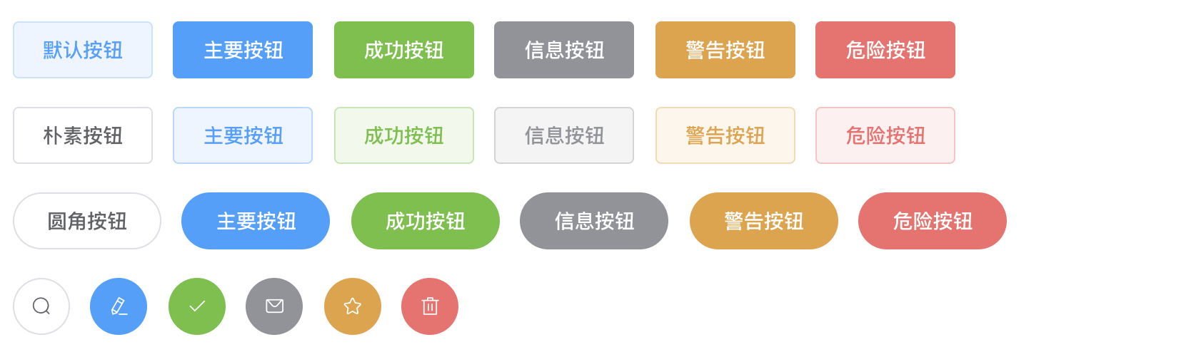
# 4. 常见按钮类型
Element-UI 的按钮组件提供了多种样式和功能选项,支持通过 type 属性快速设置按钮的颜色和风格,同时也可以通过自定义样式进一步调整。
# 4.1 按钮颜色设置
- 通过
type属性设置颜色:type属性是设置按钮颜色的主要方式。每种type都对应一种预定义的颜色和样式。 - 自定义颜色:可以通过自定义样式覆盖默认颜色,以实现更加灵活的设计需求。
# 4.2 常见按钮类型
# 1. 默认按钮
默认按钮是基础按钮样式,颜色为默认灰色。
<template>
  <el-button>默认按钮</el-button>
</template>
2
3

# 2. 主要按钮
主要按钮用于强调主操作,颜色为蓝色,通过 type="primary" 设置。
<template>
  <el-button type="primary">主要按钮</el-button>
</template>
2
3

# 3. 成功按钮
成功按钮用于表示操作成功,颜色为绿色,通过 type="success" 设置。
<template>
  <el-button type="success">成功按钮</el-button>
</template>
2
3

# 4. 警告按钮
警告按钮用于提示用户注意,颜色为黄色,通过 type="warning" 设置。
<template>
  <el-button type="warning">警告按钮</el-button>
</template>
2
3

# 5. 危险按钮
危险按钮用于提示用户注意风险,颜色为红色,通过 type="danger" 设置。
<template>
  <el-button type="danger">危险按钮</el-button>
</template>
2
3

# 6. 信息按钮
信息按钮用于提示用户一般信息,颜色为浅蓝色,通过 type="info" 设置。
<template>
  <el-button type="info">信息按钮</el-button>
</template>
2
3

# 7. 文字按钮
文字按钮无边框和背景色,仅保留文字,通过 type="text" 设置。
<template>
  <el-button type="text">文字按钮</el-button>
</template>
2
3

# 4.3 特殊样式按钮
# 1. 朴素按钮
朴素按钮具有较淡的颜色和边框,通过 plain 属性设置。
<template>
  <el-button type="primary" plain>朴素按钮</el-button>
</template>
2
3

# 2. 圆角按钮
圆角按钮用于更柔和的视觉效果,通过 round 属性设置。
<template>
  <el-button type="primary" round>圆角按钮</el-button>
</template>
2
3

# 3. 圆形按钮
圆形按钮通常用于图标按钮,通过 circle 属性和 icon 类名设置。
<template>
  <el-button type="primary" circle icon="el-icon-search"></el-button>
</template>
2
3

# 4. 加载中按钮
加载中按钮用于指示正在进行的操作,通过 loading 属性设置。
<template>
  <el-button type="primary" loading>加载中</el-button>
</template>
2
3

# 5. 禁用按钮
禁用按钮用于禁用操作,通过 disabled 属性设置。
<template>
  <el-button type="primary" disabled>禁用按钮</el-button>
</template>
2
3

# 6. 带图标的按钮
带图标的按钮用于增加视觉提示,通过 icon 属性设置。
<template>
  <el-button type="primary" icon="el-icon-edit">编辑</el-button>
</template>
2
3

# 7. 自动聚焦按钮
自动聚焦按钮用于页面加载后自动获得焦点,通过 autofocus 属性设置。
<template>
  <el-button type="primary" autofocus>自动聚焦按钮</el-button>
</template>
2
3

# 8. 原生提交按钮
原生提交按钮用于表单提交,通过 native-type="submit" 设置。
<template>
  <el-button type="primary" native-type="submit">提交按钮</el-button>
</template>
2
3

# 4.4 按钮组
按钮组用于将多个按钮组合在一起,形成一个按钮组界面,通常用于工具栏或菜单选项。
按钮组示例
<el-button-group>
  <el-button type="primary" icon="el-icon-arrow-left">上一页</el-button>
  <el-button type="primary">下一页<i class="el-icon-arrow-right el-icon--right"></i></el-button>
</el-button-group>
<el-button-group>
  <el-button type="primary" icon="el-icon-edit"></el-button>
  <el-button type="primary" icon="el-icon-share"></el-button>
  <el-button type="primary" icon="el-icon-delete"></el-button>
</el-button-group>
2
3
4
5
6
7
8
9

# 4.5 自定义按钮颜色
如果需要自定义按钮颜色,可以通过 CSS 覆盖默认样式:
<template>
  <el-button class="custom-button">自定义按钮</el-button>
</template>

<style scoped>
.custom-button {
  background-color: #ff6600;
  border-color: #ff6600;
  color: white;
}
.custom-button:hover {
  background-color: #cc5200;
  border-color: #cc5200;
}
</style>
2
3
4
5
6
7
8
9
10
11
12
13
14
15

总结
- 按钮类型和样式丰富:Element-UI 提供多种按钮类型,通过设置
type和其他属性来实现不同的样式和功能。 - 自定义颜色:可以通过自定义 CSS 覆盖默认颜色,实现个性化设计。
- 按钮组功能:通过
<el-button-group>组件可以轻松创建按钮组界面。 - 灵活的属性组合:支持加载中、禁用、图标等多种功能,增强用户交互体验。