 uni-row 快速布局
# uni-row 快速布局
# 一、使用 uni-row 和 uni-col 实现响应式布局
在小程序开发中,uni-app 提供了布局组件 uni-row 和 uni-col,这两个组件能够帮助你实现灵活的响应式布局。
uni-row用来创建一行容器,并且是基于 24 等份进行布局的。uni-col用来指定每列的宽度,span属性可以用来决定每列占用的等份数,默认为 24 等份。
# 1.1 一行的划分:24 等份布局
uni-row 组件中默认一行有 24 等份,每个 uni-col 的 span 属性决定了它占据的列数。比如,如果你想一行显示 4 个商品,并且每个商品占 6 等份,可以通过设置 span="6" 来实现。这样总共占满 24 等份。
<uni-row :gutter="20">
  <uni-col v-for="(item, index) in goodsList" :key="index" :span="6">
    <view class="goods-item">
      <image class="goods-img" :src="item.img" alt="商品图片" />
      <view class="goods-name">{{ item.name }}</view>
      <view class="goods-price">{{ item.price }}</view>
    </view>
  </uni-col>
</uni-row>
2
3
4
5
6
7
8
9
:span="6":每个uni-col占 6 等份,因此每行有 4 列。:gutter="20":列之间的间距为 20px,避免列与列之间紧密排列,提升视觉效果。
# 1.2 调整列的间隔
uni-row 组件的 gutter 属性可以设置列之间的间距。你可以传入一个数值来设置统一的横向和纵向间距,也可以传入对象来分别控制横向和纵向间距。
例如,横向间距为 10px,纵向间距为 20px:
<uni-row :gutter="{ x: 10, y: 20 }">
  <uni-col v-for="(item, index) in goodsList" :key="index" :span="6">
    <view class="goods-item">
      <image class="goods-img" :src="item.img" alt="商品图片" />
      <view class="goods-name">{{ item.name }}</view>
      <view class="goods-price">{{ item.price }}</view>
    </view>
  </uni-col>
</uni-row>
2
3
4
5
6
7
8
9
x: 10:设置列之间的横向间距为 10px。y: 20:设置列之间的纵向间距为 20px。
# 1.3 响应式布局:适应不同屏幕尺寸
通过 uni-col 的 xs, sm, md, lg 等属性,可以实现响应式布局,让页面在不同屏幕尺寸下展现不同的列数。xs 为超小屏设备(如手机),sm 为小屏设备(如平板),md 为中等屏幕设备(如普通笔记本电脑),lg 为大屏设备(如桌面显示器)。
例如,在手机上显示每行 2 个商品,在平板上显示 3 个商品,在大屏上显示 4 个商品:
<uni-row :gutter="20">
  <uni-col v-for="(item, index) in goodsList" :key="index" :xs="12" :sm="8" :md="6">
    <view class="goods-item">
      <image class="goods-img" :src="item.img" alt="商品图片" />
      <view class="goods-name">{{ item.name }}</view>
      <view class="goods-price">{{ item.price }}</view>
    </view>
  </uni-col>
</uni-row>
2
3
4
5
6
7
8
9
:xs="12":在手机上,每个商品占 12 等份(即整行),每行显示 2 个商品。:sm="8":在平板上,每个商品占 8 等份,显示 3 个商品。:md="6":在桌面端,每个商品占 6 等份,显示 4 个商品。
这样通过不同的 span 设置,布局会根据屏幕宽度自动适应。
# 二、使用 v-for 循环渲染元素
v-for 是 Vue 提供的一个指令,用于循环渲染数组或对象。我们可以结合 uni-row 和 uni-col 组件来动态渲染商品列表。比如有一个商品列表 goodsList,我们可以用 v-for 来遍历这个数组,并渲染每个商品的布局。
<uni-row :gutter="20">
  <uni-col v-for="(item, index) in goodsList" :key="index" :span="6">
    <view class="goods-item">
      <image class="goods-img" :src="item.img" alt="商品图片" />
      <view class="goods-name">{{ item.name }}</view>
      <view class="goods-price">{{ item.price }}</view>
    </view>
  </uni-col>
</uni-row>
2
3
4
5
6
7
8
9
v-for="(item, index) in goodsList":遍历goodsList数组中的每个商品。:key="index":为每个uni-col设置一个唯一的key,提高渲染效率。:span="6":每个商品占 6 等份宽度,四列布局。
# 三、高级功能:加载更多商品
当商品数据很多时,你可能希望实现“加载更多”的功能。这时可以在数据中分页,每次加载一部分商品,并通过按钮让用户加载更多。
<template>
  <view class="content">
    <uni-row :gutter="20">
      <uni-col v-for="(item, index) in displayGoods" :key="index" :span="6">
        <view class="goods-item">
          <image class="goods-img" :src="item.img" alt="商品图片" />
          <view class="goods-name">{{ item.name }}</view>
          <view class="goods-price">{{ item.price }}</view>
        </view>
      </uni-col>
    </uni-row>
    <button @click="loadMore" class="load-more-btn">加载更多</button>
  </view>
</template>

<script>
export default {
  data() {
    return {
      goodsList: [
        { img: '/static/img/good1.jpg', name: '商品1', price: '¥99.00' },
        { img: '/static/img/good2.jpg', name: '商品2', price: '¥199.00' },
        { img: '/static/img/good3.jpg', name: '商品3', price: '¥299.00' },
        { img: '/static/img/good4.jpg', name: '商品4', price: '¥399.00' },
        // 更多商品数据
      ],
      displayGoods: []  // 当前显示的商品
    }
  },
  mounted() {
    this.loadMore();
  },
  methods: {
    loadMore() {
      const nextItems = this.goodsList.slice(this.displayGoods.length, this.displayGoods.length + 4);
      this.displayGoods = [...this.displayGoods, ...nextItems];
    }
  }
}
</script>

<style scoped>
.load-more-btn {
  width: 100%;
  padding: 10px;
  background-color: #ff4d4f;
  color: white;
  font-size: 16px;
  border: none;
  border-radius: 4px;
}
</style>
2
3
4
5
6
7
8
9
10
11
12
13
14
15
16
17
18
19
20
21
22
23
24
25
26
27
28
29
30
31
32
33
34
35
36
37
38
39
40
41
42
43
44
45
46
47
48
49
50
51
52
loadMore方法通过slice提取下一个需要显示的商品数据,然后将其追加到displayGoods数组中。v-for渲染当前显示的商品,点击按钮加载更多。
好的,我将根据你提供的代码和需求,将其整理成一个详细的案例教程,帮助你了解如何实现这个商品列表布局,包括对图片、商品信息和按钮样式的调整,以及如何通过 uni-row 和 uni-col 实现响应式布局。
# 四、商品列表布局实现教程
# 4.1 布局整体结构
本案例展示了一个商品列表页面,使用 uni-app 提供的 uni-row 和 uni-col 来实现商品的响应式布局,商品信息包括商品图片、名称、价格以及两个按钮:加入购物车和立即购买。通过 swiper 组件实现轮播图展示,并使用 setInterval 随机显示公告。
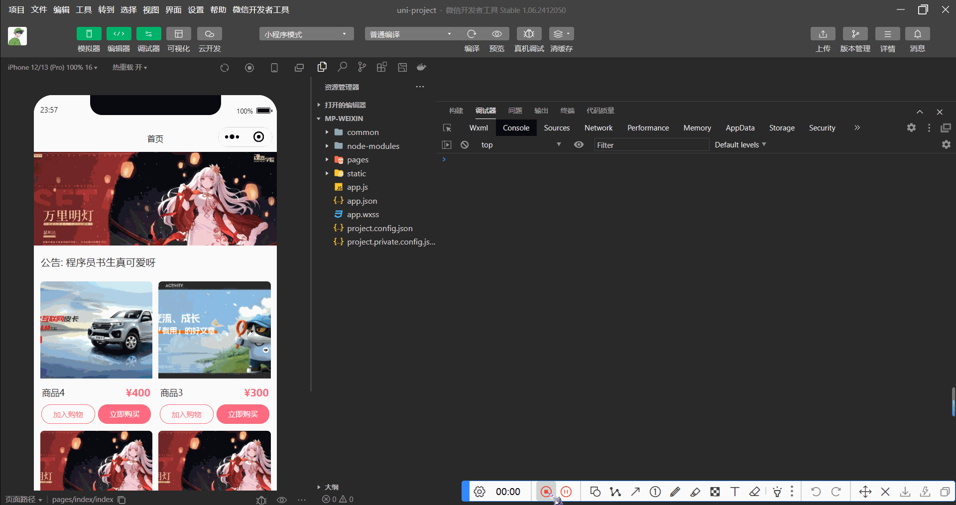
# 4.2 实现步骤
# 2-1 商品列表的基础结构
在 uni-app 中,我们使用 uni-row 和 uni-col 来创建商品卡片的布局。uni-row 用来定义一行,uni-col 用来定义列的宽度。
<template>
  <view class="content">
    <!-- 轮播图部分 -->
    <!-- 使用swiper组件实现轮播图,设置自动播放、循环滚动、间隔时间和指示点 -->
    <swiper class="swiper" :autoplay="true" :circular="true" :interval="3000" :indicator-dots="true" :duration="500">
      <!-- swiper-item 是轮播图中的每一项,这里使用 v-for 来遍历 swiperList 数组中的每个项 -->
      <swiper-item v-for="item in swiperList" :key="item">
        <!-- 显示图片,设置模式为 widthFix 保证宽度适应,图片宽度占满100% -->
        <image :src="item" mode="widthFix" style="width: 100%; " />
      </swiper-item>
    </swiper>

    <!-- 公告部分 -->
    <!-- 显示公告,公告内容绑定了 notice 数据 -->
    <view class="notice">
      <text>公告: {{ notice }}</text>
    </view>

    <!-- 商品列表部分 -->
    <view class="goods-list">
      <!-- 使用 uni-row 创建行容器,:gutter="20" 设置列之间的间距为 20px -->
      <uni-row class="goods-row" :gutter="20">
        <!-- 使用 v-for 遍历 goodsList 数组,生成每个商品的列,:span="12" 表示每列占 12 等份 -->
        <uni-col :span="12" v-for="item in goodsList" :key="item.id">
          <!-- 商品项 -->
          <view class="goods-item">
            <!-- 商品图片,使用 mode="aspectFill" 保证图片填充并裁剪多余部分 -->
            <image :src="item.img" mode="aspectFill" class="goods-image" />
            <!-- 商品信息区域,包括商品名称和价格 -->
            <view class="goods-info">
              <text class="goods-name">{{ item.name }}</text>
              <text class="goods-price">¥{{ item.price }}</text>
            </view>
            <!-- 商品按钮区域,包括加入购物车和立即购买按钮 -->
            <view class="goods-buttons">
              <!-- 加入购物车按钮,点击时触发 addToCart 方法 -->
              <button class="cart-btn" @click="addToCart(item)">加入购物车</button>
              <!-- 立即购买按钮,点击时触发 buyNow 方法 -->
              <button class="buy-btn" @click="buyNow(item)">立即购买</button>
            </view>
          </view>
        </uni-col>
      </uni-row>
    </view>
  </view>
</template>
2
3
4
5
6
7
8
9
10
11
12
13
14
15
16
17
18
19
20
21
22
23
24
25
26
27
28
29
30
31
32
33
34
35
36
37
38
39
40
41
42
43
44
45
46
# 2-2 商品数据与轮播图数据
在 data 中,我们定义了商品列表 goodsList 和轮播图 swiperList。轮播图是通过 swiper 实现的,商品列表通过 v-for 循环渲染。
export default {
  data() {
    return {
      swiperList: [
        'https://img2.baidu.com/it/u=2391467471,3212210600&fm=253&fmt=auto&app=138&f=JPEG?w=1011&h=374',
        'https://img2.baidu.com/it/u=3124829697,2175694045&fm=253&fmt=auto&app=138&f=JPEG?w=889&h=500',
        'https://img0.baidu.com/it/u=262402321,3310484181&fm=253&fmt=auto&app=138&f=JPEG?w=1018&h=500',
        'https://img1.baidu.com/it/u=2222665852,1606584561&fm=253&fmt=auto&app=138&f=JPEG?w=1097&h=500'
      ],
      noticeList: ['程序员书生真酷呀', '程序员书生真帅呀', '程序员书生真可爱呀', '程序员书生真有气质呀'],
      notice: '',
      goodsList: [
        { id: 1, name: '商品1', price: '79', img: 'https://img2.baidu.com/it/u=3124829697,2175694045&fm=253&fmt=auto&app=138&f=JPEG?w=889&h=500' },
        { id: 2, name: '商品2', price: '200', img: 'https://img2.baidu.com/it/u=3124829697,2175694045&fm=253&fmt=auto&app=138&f=JPEG?w=889&h=500' },
        { id: 3, name: '商品3', price: '300', img: 'https://img0.baidu.com/it/u=262402321,3310484181&fm=253&fmt=auto&app=138&f=JPEG?w=1018&h=500' },
        { id: 4, name: '商品4', price: '400', img: 'https://img1.baidu.com/it/u=2222665852,1606584561&fm=253&fmt=auto&app=138&f=JPEG?w=1097&h=500' }
      ]
    };
  }
}
2
3
4
5
6
7
8
9
10
11
12
13
14
15
16
17
18
19
20
# 2-3 公告更新
使用 setInterval 定时器每隔 1 秒随机显示一个公告,公告内容保存在 noticeList 数组中。
mounted() {
  this.getNotice();
},
methods: {
  getNotice() {
    setInterval(() => {
      this.notice = this.noticeList[Math.floor(Math.random() * this.noticeList.length)];
    }, 1000);
  }
}
2
3
4
5
6
7
8
9
10
# 2-4 商品图片样式
商品的图片需要保证不变形,同时填充整个容器。我们使用 object-fit: cover 来确保图片填满容器并裁剪多余部分。
.goods-image {
  width: 100%;
  height: 300rpx;  /* 固定高度,保持一致性 */
  object-fit: cover;  /* 填充容器,不失真 */
}
2
3
4
5
# 2-5 商品名称与价格样式
商品名称采用 text-overflow: ellipsis 实现文本溢出时显示省略号,保证商品名称不超出边界。商品价格使用突出显示的样式,并加大字体。
.goods-name {
  font-size: 28rpx;  /* 设置商品名称的字体大小为28rpx */
  color: #333;  /* 设置商品名称的字体颜色为深灰色 */
  display: block;  /* 设置为块级元素,确保占据一整行 */
  overflow: hidden;  /* 隐藏超出容器范围的内容 */
  text-overflow: ellipsis;  /* 当文本超出容器时,显示省略号 (...) */
  white-space: nowrap;  /* 强制文本显示为单行,不换行 */
}

.goods-price {
  font-size: 32rpx;  /* 设置商品价格的字体大小为32rpx,突出显示 */
  color: #ff6b81;  /* 设置商品价格的字体颜色为粉红色,吸引注意 */
  font-weight: bold;  /* 设置字体为加粗 */
  display: block;  /* 设置为块级元素,确保占据一整行 */
  margin: 10rpx 0;  /* 设置上下间距为10rpx,确保与其他元素之间有适当的空间 */
}
2
3
4
5
6
7
8
9
10
11
12
13
14
15
16
# 2-6 按钮布局样式
商品卡片的按钮使用 flex 布局进行排列,确保按钮的宽度一致,并通过 border-radius 设置圆角,使按钮更具可点击感。
.goods-buttons {
  display: flex;  /* 使用 flex 布局,使按钮水平排列 */
  align-items: center;  /* 垂直居中按钮 */
  justify-content: space-between;  /* 在行内均匀分布按钮 */
  padding: 2rpx 4rpx;  /* 设置按钮区域的内边距,2rpx 上下,4rpx 左右 */
  gap: 10rpx;  /* 按钮之间的间距为 10rpx */
}

.cart-btn, .buy-btn {
  width: 100%;  /* 按钮宽度占满父容器的宽度 */
  height: 60rpx;  /* 设置按钮的高度为 60rpx */
  line-height: 60rpx;  /* 设置按钮文本垂直居中 */
  text-align: center;  /* 设置文本水平居中 */
  border-radius: 30rpx;  /* 设置按钮的圆角,30rpx 使按钮变为圆形的角 */
  font-size: 24rpx;  /* 设置按钮文本的字体大小为 24rpx */
}

.cart-btn {
  background: #fff;  /* 设置加入购物车按钮的背景色为白色 */
  color: #ff6b81;  /* 设置按钮文本的颜色为粉红色(#ff6b81) */
  border: 1px solid #ff6b81;  /* 设置按钮的边框为粉红色 */
}

.buy-btn {
  background: #ff6b81;  /* 设置立即购买按钮的背景色为粉红色 */
  color: #fff;  /* 设置按钮文本的颜色为白色 */
}
2
3
4
5
6
7
8
9
10
11
12
13
14
15
16
17
18
19
20
21
22
23
24
25
26
27
# 2-7 响应式布局
通过 uni-col 的 span 属性,可以在不同设备上实现不同的列数,保证布局自适应。比如,在手机端每行显示 2 个商品,在平板端每行 4 个商品。
<uni-col :xs="12" :sm="8" :md="6" v-for="item in goodsList" :key="item.id">
  <!-- 商品内容 -->
</uni-col>
2
3