 单选按钮组组件
# 单选按钮组组件
radio-group 是 Uniapp 中的单项选择器,通过将多个 <radio> 包裹在 radio-group 下,实现单项选择的功能。当用户选择其中一个 <radio> 时,其他 <radio> 会自动取消选中状态。radio-group 常用于表单中的单项选择场景。
# 1. 什么是 radio-group 组件?
radio-group 组件用于实现单项选择功能,它内部通过 radio 组件表示每一个选项,用户只能选择其中的一个。radio-group 会监听选中状态的变化,通过事件传递选中的值。
使用场景
- 表单单项选择:用户可以在多个互斥选项中选择一项,例如选择性别、国籍等。
- 设置选项:在应用设置中,当需要让用户从多个设置中选择一个时,
radio-group是理想选择。 - 问卷调查:在问卷或调查中使用,允许用户从一组答案中选择一个。
# 2. radio-group 组件的常用属性
radio-group 组件和 radio 组件各自有多个属性,可以控制单选框的样式、选中状态、颜色等。下面是 radio-group 和 radio 的常用属性及事件说明:
# 2.1 radio-group 属性
| 属性名 | 类型 | 说明 |
|---|---|---|
| @change | EventHandle | 当 radio-group 中的选中项发生变化时触发 change 事件,event.detail.value 为选中的 radio 的 value。 |
# 2.2 radio 属性
| 属性名 | 类型 | 默认值 | 说明 |
|---|---|---|---|
value | String | 每个 radio 的标识。当该 radio 被选中时,radio-group 的 change 事件会携带该 radio 的 value 值。 | |
checked | Boolean | false | 当前是否选中。 |
disabled | Boolean | false | 是否禁用该 radio。 |
color | Color | radio 的颜色,类似于 CSS 的 color 属性。 | |
backgroundColor | Color | #ffffff | radio 的背景颜色。 |
borderColor | Color | #d1d1d1 | radio 的边框颜色。 |
activeBackgroundColor | Color | #007AFF | 当 radio 选中时的背景颜色。 |
activeBorderColor | Color | 当 radio 选中时的边框颜色。 | |
iconColor | Color | #ffffff | radio 图标的颜色。 |
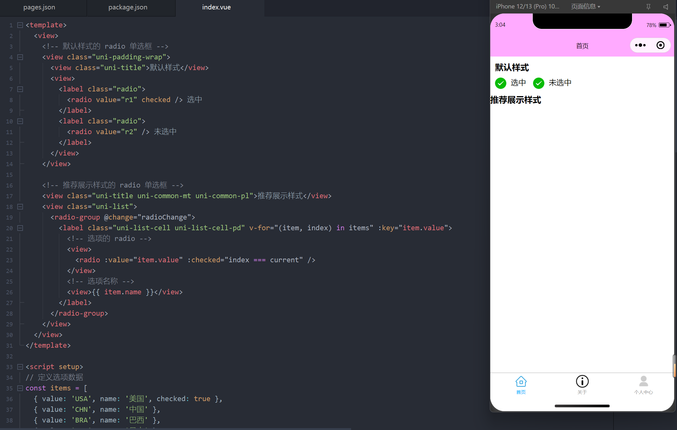
# 3. 默认样式和推荐展示样式
下面是一个简单的 radio-group 案例,展示了两种常见的单选框样式:默认样式和推荐展示样式。通过监听 change 事件,获取用户选择的结果。
<template>
  <view>
    <!-- 默认样式的 radio 单选框 -->
    <view class="uni-padding-wrap">
      <view class="uni-title">默认样式</view>
      <view>
        <label class="radio">
          <radio value="r1" checked /> 选中
        </label>
        <label class="radio">
          <radio value="r2" /> 未选中
        </label>
      </view>
    </view>

    <!-- 推荐展示样式的 radio 单选框 -->
    <view class="uni-title uni-common-mt uni-common-pl">推荐展示样式</view>
    <view class="uni-list">
      <radio-group @change="radioChange">
        <label class="uni-list-cell uni-list-cell-pd" v-for="(item, index) in items" :key="item.value">
          <!-- 选项的 radio -->
          <view>
            <radio :value="item.value" :checked="index === current" />
          </view>
          <!-- 选项名称 -->
          <view>{{ item.name }}</view>
        </label>
      </radio-group>
    </view>
  </view>
</template>

<script setup>
// 定义选项数据
const items = [
  { value: 'USA', name: '美国', checked: true },
  { value: 'CHN', name: '中国' },
  { value: 'BRA', name: '巴西' },
  { value: 'JPN', name: '日本' },
  { value: 'ENG', name: '英国' },
  { value: 'FRA', name: '法国' }
];

// 定义当前选中的 radio 索引
const current = ref(0);

// 监听 radio 变化事件
const radioChange = (e) => {
  // 更新当前选中索引
  const selectedValue = e.detail.value;
  current.value = items.findIndex(item => item.value === selectedValue);
};
</script>

<style scoped>
.uni-padding-wrap {
  padding: 10px;
}

.uni-title {
  font-size: 18px;
  font-weight: bold;
  margin-bottom: 10px;
}

.uni-list {
  margin-top: 20px;
}

.uni-list-cell {
  display: flex;
  justify-content: space-between;
  padding: 10px;
  border-bottom: 1px solid #ddd;
}

.radio {
  margin-right: 10px;
}
</style>
1
2
3
4
5
6
7
8
9
10
11
12
13
14
15
16
17
18
19
20
21
22
23
24
25
26
27
28
29
30
31
32
33
34
35
36
37
38
39
40
41
42
43
44
45
46
47
48
49
50
51
52
53
54
55
56
57
58
59
60
61
62
63
64
65
66
67
68
69
70
71
72
73
74
75
76
77
78
79
80
2
3
4
5
6
7
8
9
10
11
12
13
14
15
16
17
18
19
20
21
22
23
24
25
26
27
28
29
30
31
32
33
34
35
36
37
38
39
40
41
42
43
44
45
46
47
48
49
50
51
52
53
54
55
56
57
58
59
60
61
62
63
64
65
66
67
68
69
70
71
72
73
74
75
76
77
78
79
80
代码说明
items数据:这是一个包含多个国家选项的数组,每个radio都对应一个选项。radioChange事件:当用户选择某个选项时,触发change事件,更新当前选中的选项。- 双向绑定:通过
v-for遍历items数据,动态生成radio选项,同时根据current变量确定选中的项。
编辑此页 (opens new window)
上次更新: 2025/02/01, 02:18:15