 轮播图组件
轮播图组件
# 轮播图组件
swiper 组件是 Uniapp 中用于创建滑块视图切换的核心组件,广泛应用于轮播图、Banner 广告等场景。与滚动组件不同,swiper 以屏幕为单位进行滑动切换,支持横向和纵向滑动,并可以通过多个属性配置自动播放、循环播放、指示点等功能。
# 1. 什么是 swiper 组件?
swiper 组件用于在固定区域内展示一组滑块内容,支持横向或纵向滑动切换。每个滑块都由 swiper-item 组件表示。通过结合属性配置,swiper 可以轻松实现自动轮播、循环切换、指示点提示等功能,是移动端界面中非常常见的交互方式。
使用场景
- 轮播图展示:用于广告展示、图片轮播,用户可以通过滑动或自动播放查看多个内容。
- 页面切换:实现页面级别的滑动切换效果,适合类似于 Tab 切换或全屏页面展示。
- 多项内容展示:在一屏内显示多项内容,并通过滑动切换查看全部内容。
# 2. swiper 组件的常用属性
swiper 组件提供了多种属性,用于控制滑块的显示方式和交互效果。以下是常用属性的详细说明及使用示例:
| 属性名 | 类型 | 默认值 | 说明 |
|---|---|---|---|
indicator-dots | Boolean | false | 是否显示滑块面板下方的指示点。指示点用于提示用户当前所在滑块位置。 |
indicator-color | Color | rgba(0, 0, 0, .3) | 指示点的默认颜色。 |
indicator-active-color | Color | #000000 | 当前选中滑块的指示点颜色。 |
autoplay | Boolean | false | 是否自动切换滑块。启用后,滑块会按指定的时间间隔自动切换。 |
current | Number | 0 | 当前显示的滑块索引。 |
interval | Number | 5000 | 自动切换的时间间隔,单位为毫秒。 |
duration | Number | 500 | 滑动动画的时长,单位为毫秒。 |
circular | Boolean | false | 是否启用循环滑动。若为 true,滑动到最后一个滑块时会自动返回第一个。 |
vertical | Boolean | false | 设置滑动方向为纵向。默认情况下为横向滑动。 |
previous-margin | String | 0px | 设置前边距,用于控制前一项滑块部分显示,单位为 px 或 rpx。 |
next-margin | String | 0px | 设置后边距,用于控制后一项滑块部分显示,单位为 px 或 rpx。 |
display-multiple-items | Number | 1 | 设置同时显示的滑块数量。 |
skip-hidden-item-layout | Boolean | false | 是否跳过未显示的滑块布局。设为 true 时,可以优化滑动性能。 |
easing-function | String | default | 指定滑块切换时的动画效果,包括 default、linear、easeInCubic 等。 |
# 2.1 显示指示点 indicator-dots
- 说明:是否显示滑块下方的指示点,用于指示当前滑块所在的位置。
- 类型:
Boolean - 默认值:
false
<template>
  <swiper indicator-dots="true">
    <swiper-item>
      <view class="swiper-item">A</view>
    </swiper-item>
    <swiper-item>
      <view class="swiper-item">B</view>
    </swiper-item>
    <swiper-item>
      <view class="swiper-item">C</view>
    </swiper-item>
  </swiper>
</template>

<style scoped>
.swiper-item {
  height: 300rpx;
  background-color: lightblue;
  text-align: center;
  line-height: 300rpx;
}
</style>
1
2
3
4
5
6
7
8
9
10
11
12
13
14
15
16
17
18
19
20
21
22
2
3
4
5
6
7
8
9
10
11
12
13
14
15
16
17
18
19
20
21
22
# 2.2 自动播放 autoplay
- 说明:是否启用自动切换功能。启用后,滑块将按照
interval时间间隔自动切换。 - 类型:
Boolean - 默认值:
false
<template>
  <swiper :autoplay="true" :interval="3000">
    <swiper-item>
      <view class="swiper-item">Slide 1</view>
    </swiper-item>
    <swiper-item>
      <view class="swiper-item">Slide 2</view>
    </swiper-item>
    <swiper-item>
      <view class="swiper-item">Slide 3</view>
    </swiper-item>
  </swiper>
</template>

<style scoped>
.swiper-item {
  height: 300rpx;
  background-color: lightcoral;
  text-align: center;
  line-height: 300rpx;
}
</style>
1
2
3
4
5
6
7
8
9
10
11
12
13
14
15
16
17
18
19
20
21
22
2
3
4
5
6
7
8
9
10
11
12
13
14
15
16
17
18
19
20
21
22
# 2.3 循环滑动 circular
- 说明:是否启用循环滑动。启用后,滑动到最后一个滑块时会自动切换到第一个滑块,实现循环播放。
- 类型:
Boolean - 默认值:
false
<template>
  <swiper :circular="true">
    <swiper-item>
      <view class="swiper-item">1</view>
    </swiper-item>
    <swiper-item>
      <view class="swiper-item">2</view>
    </swiper-item>
    <swiper-item>
      <view class="swiper-item">3</view>
    </swiper-item>
  </swiper>
</template>

<style scoped>
.swiper-item {
  height: 300rpx;
  background-color: lightgreen;
  text-align: center;
  line-height: 300rpx;
}
</style>
1
2
3
4
5
6
7
8
9
10
11
12
13
14
15
16
17
18
19
20
21
22
2
3
4
5
6
7
8
9
10
11
12
13
14
15
16
17
18
19
20
21
22
# 2.4 设置动画时长 duration
- 说明:设置滑块切换时的动画时长,单位为毫秒。
- 类型:
Number - 默认值:
500
<template>
  <swiper :autoplay="true" :duration="1000">
    <swiper-item>
      <view class="swiper-item">1</view>
    </swiper-item>
    <swiper-item>
      <view class="swiper-item">2</view>
    </swiper-item>
    <swiper-item>
      <view class="swiper-item">3</view>
    </swiper-item>
  </swiper>
</template>

<style scoped>
.swiper-item {
  height: 300rpx;
  background-color: lightyellow;
  text-align: center;
  line-height: 300rpx;
}
</style>
1
2
3
4
5
6
7
8
9
10
11
12
13
14
15
16
17
18
19
20
21
22
2
3
4
5
6
7
8
9
10
11
12
13
14
15
16
17
18
19
20
21
22
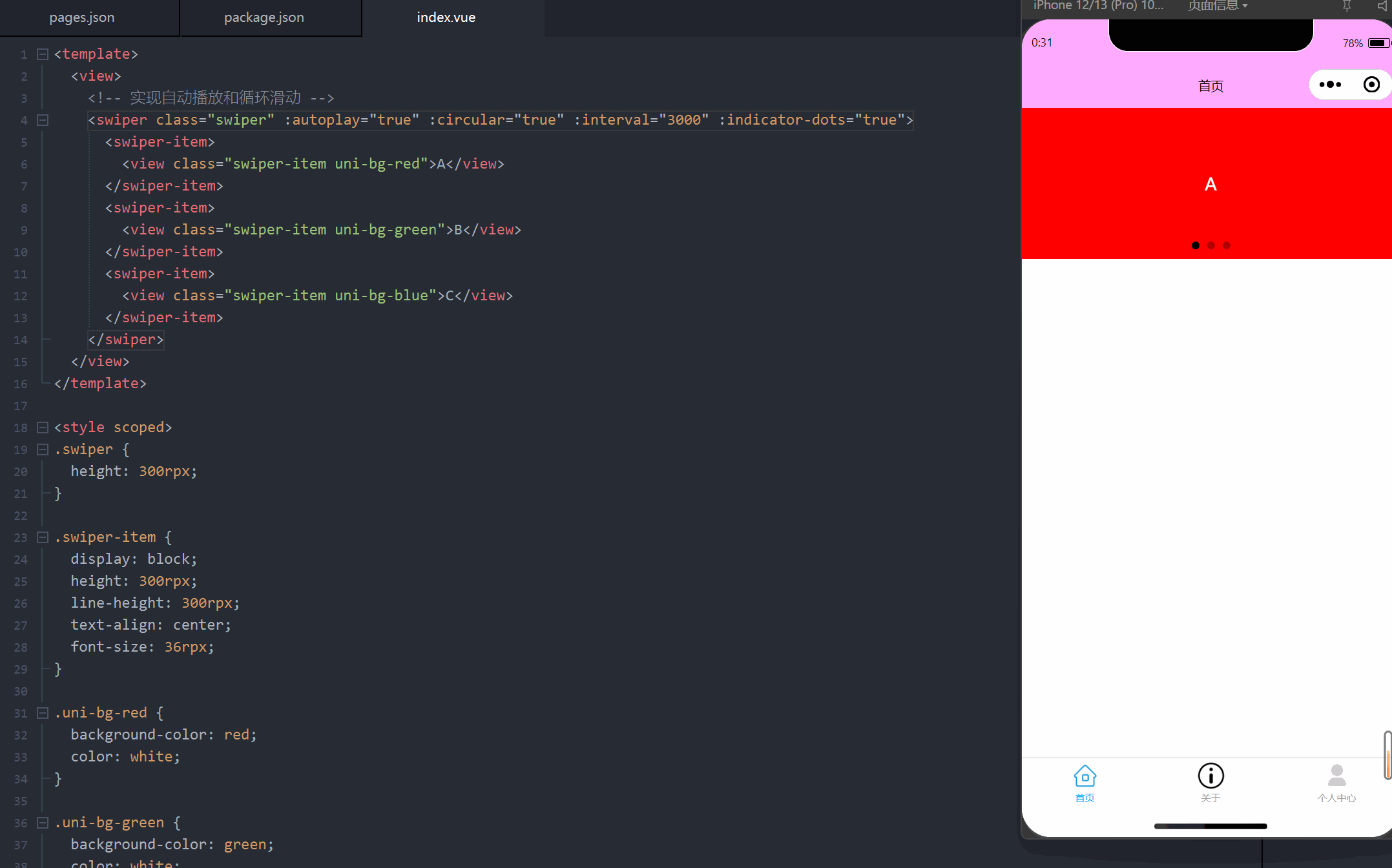
# 3. 自动播放与指示点效果案例
以下案例展示了 swiper 组件的实际应用,包括自动播放、循环滑动和指示点的设置。通过组合多个属性,可以灵活实现符合需求的滑动效果。
<template>
  <view>
    <!-- 实现自动播放和循环滑动 -->
    <swiper class="swiper" :autoplay="true" :circular="true" :interval="3000" :indicator-dots="true">
      <swiper-item>
        <view class="swiper-item uni-bg-red">A</view>
      </swiper-item>
      <swiper-item>
        <view class="swiper-item uni-bg-green">B</view>
      </swiper-item>
      <swiper-item>
        <view class="swiper-item uni-bg-blue">C</view>
      </swiper-item>
    </swiper>
  </view>
</template>

<style scoped>
.swiper {
  height: 300rpx;
}

.swiper-item {
  display: block;
  height: 300rpx;
  line-height: 300rpx;
  text-align: center;
  font-size: 36rpx;
}

.uni-bg-red {
  background-color: red;
  color: white;
}

.uni-bg-green {
  background-color: green;
  color: white;
}

.uni-bg-blue {
  background-color: blue;
  color: white;
}
</style>
1
2
3
4
5
6
7
8
9
10
11
12
13
14
15
16
17
18
19
20
21
22
23
24
25
26
27
28
29
30
31
32
33
34
35
36
37
38
39
40
41
42
43
44
45
2
3
4
5
6
7
8
9
10
11
12
13
14
15
16
17
18
19
20
21
22
23
24
25
26
27
28
29
30
31
32
33
34
35
36
37
38
39
40
41
42
43
44
45
编辑此页 (opens new window)
上次更新: 2025/02/01, 02:18:15